02 | ORACULI: increasing site conversion and legitimacy for a non-profit through a website redesign.
SERVICE:
DESKTOP WEBSITE
TEAM:
MYSELF (UI/UX DESIGNER)
KHIARA ZHANG (UX/UI DESIGNER)
ANDREA LI (BOARD MEMBER)
ANNIE SUN (CO-FOUNDER)
TOOLKIT:
SPRINGBOARD
PEN, PAPER, AND POST-IT NOTES
FIGMA
GOOGLE DRIVE, MEET, AND DOCUMENTS
DISCORD
SQUARESPACE
CLIENT:
ORACULI: REGISTERED 501(c)(3) NONPROFIT
TIMELINE:
4 WEEKS
MARCH 14 - APRIL 7
PROJECT OVERVIEW
INSPIRING THE NEXT GENERATION: REVAMPING ORACULI'S WEBSITE
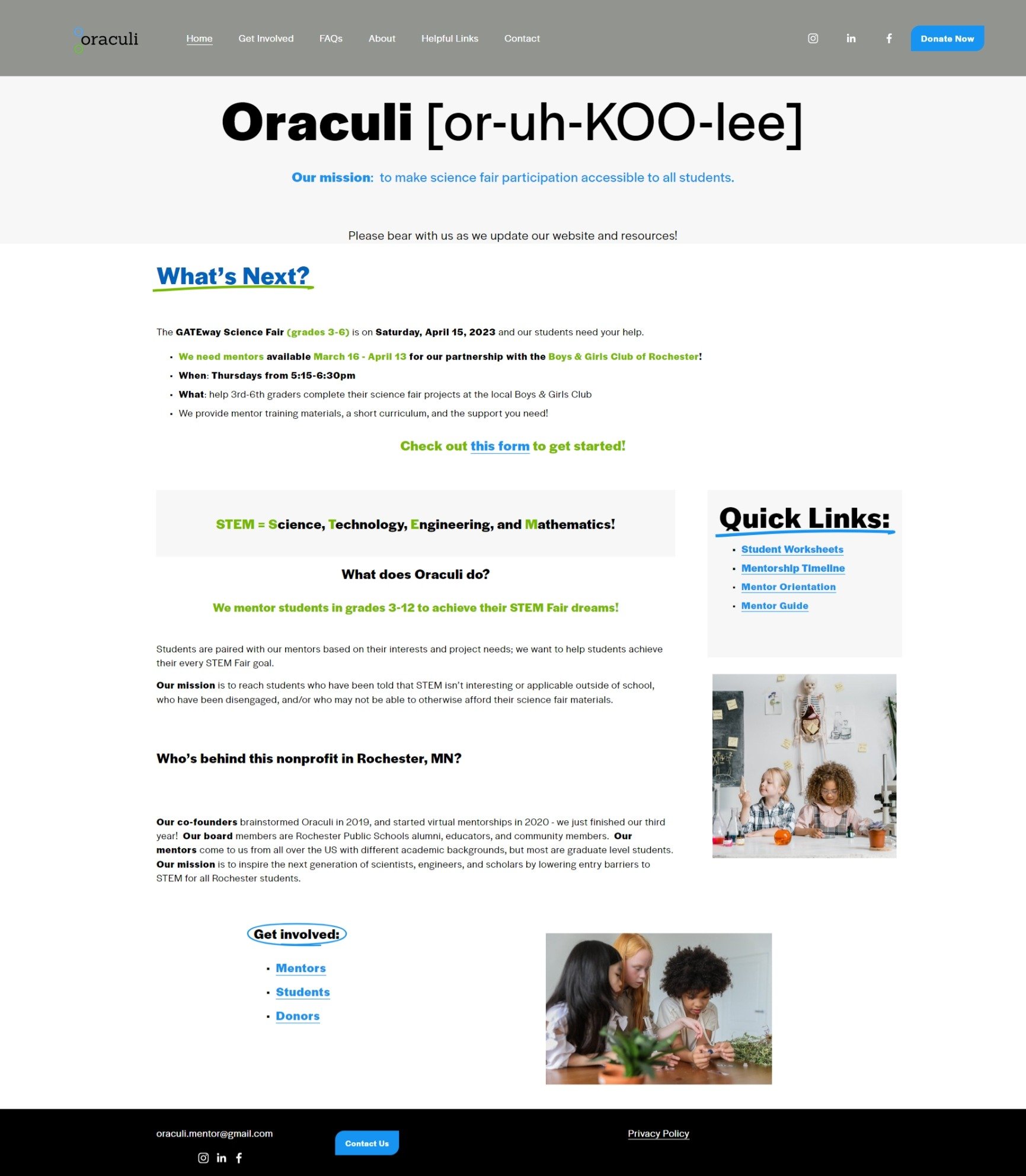
STEM can be intimidating without adequate resources and guidance. Oraculi aims to inspire the next generation of scholars through mentorship and Science Fair participation. However, Oraculi’s mission was being overshadowed by the cluttered and confusing website.
As a two-person design team, we redesigned the website based on UX principles by reorganizing the information architecture and visuals of the site.
PROBLEM SCOPE
DISORGANIZATION AND DECISION FATIGUE
The website's disorganized layout, inconsistent colors, and jumbled font styles and sizes caused decision fatigue and confusion among users.
Moreover, Oraculi’s confusing layout caused students/mentors to reference a Google Doc with a mastersheet of links instead of the website, because it had all of the same information (such as the curriculum), without the headache.
FINAL SOLUTIONS:
ENHANCING NAVIGATION & CONTENT INTEGRATION
Understanding the pain points and user needs, we made the following improvements to the website’s user experience:
Simplified navigation and information architecture for better user experience.
Transferred crucial info from Google doc to the website to encourage more traffic.
Created a visually appealing, intuitive, and mobile-friendly redesign.
SETTING THE STAGE FOR SUCCESS:
COLLABORATIVE KICKOFF: DEFINING KPIS TOGETHER
We met with our stakeholders to determine their needs and how we could best help them. Their goals were to:
See more views on the website
Create a website that accurately reflected their brand
Receive more mentor sign-ups
Because Oraculi is a small non-profit with low UX maturity, they gave us the go-ahead to do anything we liked in order to achieve these key performance indicators.
COMPETITIVE MARKET RESEARCH
CRAFTING A REDESIGN BASED ON BEST PRACTICES
Through my competitive market research of non-profit mentorship organizations, I discovered the key to success for these types of programs was transparency and trust.
User-friendly interfaces, easy-to-navigate menus, and clear instructions created a positive user experience. Therefore, we made sure that our redesign emphasized these values and that our designs followed the same clear and positive structure.
GATHERING CONTEXT - USER SURVEYS
PEERING THROUGH USER'S EYES: AESTHETICS, TRUST, AND USABILITY
To better understand the user’s perspective on the website's aesthetics, trustworthiness, and ease of use, I created a user survey to gather more context.
There were two versions of the survey, one tailored to local Oraculi students and mentors, and another more generalized survey to the public. From this survey, we found out:
Only half of the participants could easily find information on the mentorship program.
Most of the participants struggled to find the buttons/CTAs among the visual clutter.
The feedback we received from these surveys informed our design decisions going forward.
GATHERING MORE CONTEXT
NAVIGATING USER PAIN POINTS: TASK-BASED USABILITY TESTING
I crafted the usability test script and conducted two out of five of the usability tests.
We gave participants tasks to complete, including asking them to find a way to contact Oraculi, sign up as a mentor, and find a way to donate. Our goal was to understand users' pain points and identify any potential conversion drop-offs for both mentors and students.
SYNTHESIS
ANALYZING THE DATA
We discovered three key issues users had when using the website:
Information overload and lack of clear hierarchy: Participants struggled to understand the website's mission and find relevant information due to too much text, inconsistencies in information organization, and unclear labeling.
Difficulty in finding information: Participants had trouble locating specific information and forms. Additionally, there was a lack of clarity on the mission statement and the screening process for becoming an Oraculi mentor.
Outdated visual design: Participants felt the website was outdated, cluttered, and lacked visual appeal, which hurt their perception of the site's authenticity
SYNTHESIS
“HOW MIGHT WE…” QUESTIONS TO CONSIDER
How might we streamline the sign-up process for students/mentors?
How might we increase the trustworthiness of our site and increase legitimacy?
How might we improve the site's information architecture for ease of navigation?
How might we design the website to be visually appealing to both children and adults?
SITEMAP
SITEMAP-DRIVEN RESTRUCTURE FOR EASY NAVIGATION
After creating a sitemap of the original website, which revealed repeated information and broken links, we restructured the website's information architecture using the sitemap as a guide to make it more clear and easy-to-navigate.
FINDING SOLUTIONS
REVAMPING THE USER EXPERIENCE WITH STRATEGIC SOLUTIONS
Based on our research and user feedback, we decided to focus on three main solutions to help Oraculi's website:
To address the information overload users were facing, we simplified the website's information architecture. We also reduced the amount of text on each page and used visual cues, such as headings and section breaks.
To make it easy to find information, we added clear and consistent labels for each page and section. We also added buttons and cards to act as CTAs.
To improve the visual design of the website, we updated the website's graphics and fonts to create a more modern and cohesive look that removed clutter. We also made the website mobile-responsive.
STYLE GUIDE
DESIGNING WITH PURPOSE: CREATING COHESIVE BRANDING AND A STYLE GUIDE
Our team worked closely with the project head from Oraculi, to establish the brand personality and attributes.
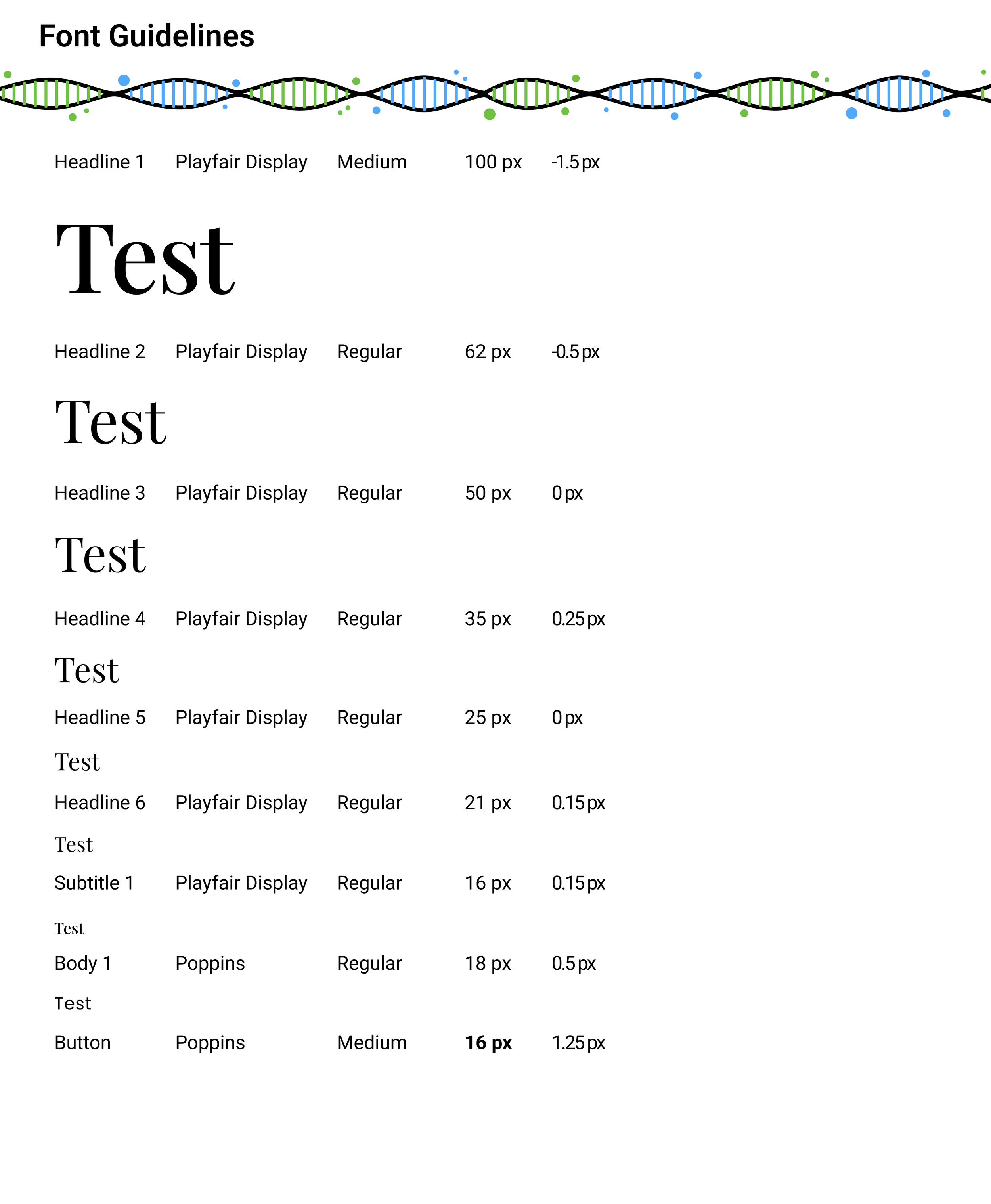
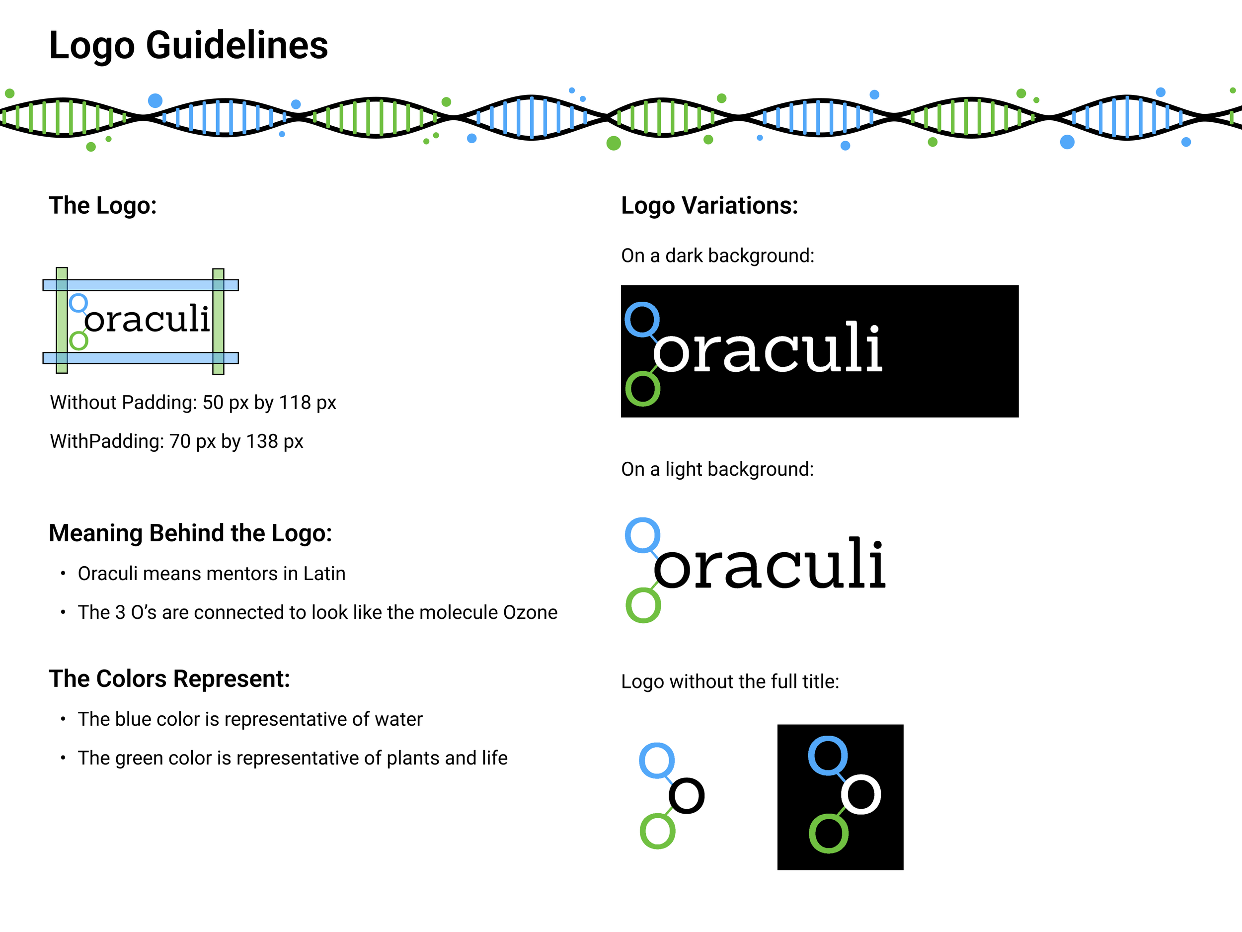
We created a style guide that helped ensure consistency and cohesiveness throughout the website and all Oraculi materials, including darker and more accessible colors.
MEDIUM-FIDELITY WIREFRAMES
TURNING IDEAS INTO INTERACTION: CRAFTING A WORKABLE PROTOTYPE
Next, my team developed medium-fidelity wireframes that were presented to stakeholders who provided feedback that allowed us to make further changes to the design.
Through this iterative process, we were able to refine the wireframes to be more in-line with Oraculi's wishes. We then used these wireframes to move forward with usability testing.


USABILITY TESTING
ENHANCING USABILITY THROUGH ITERATION: CONTINUED TESTING AND REFINEMENT
With the medium-fidelity wireframes, I conducted three out of the five usability tests. We used the same test script as before to compare results.
While we made several improvements based on the feedback, the key finding revolved around issues with the information architecture, where the dropdown menus were concealing essential information. These findings prompted us to revisit the design and make further enhancements.
Here are our usability testing feedback-based changes.
CHANGE 03— Creating more visual interest and better hierarchy of information.
Testing showed ineffective banner placement and user resistance to early recruitment prompts, so I placed the banner after the contextual info and shortened the amount of text.
The right image felt out of place and uninteresting, so I reimagined the images on the right with imagery that mimicked the circular mascot for consistency with brand personality.
CHANGE 01— Dispersing the Helpful Links Page content to other pages.
Participants were not sure what "Helpful Links" were on the header and instead tried to find the info on other pages. Due to this, we deleted the Helpful Links Page and dispersed the links onto other pages. For example, Science Fair Information and Student Resources went to the Students Page. This made information much easier to find.
CHANGE 02— Simplifying the navigation so that a dropdown menu was no longer necessary.
We specifically added "mentors" and "students" as their own pages on the header, and we merged "Our Story" and "Our Board" into one page called "About Us." We also added an underline for the header so that the hover state wasn't just reliant on color.
COLLABORATION
HANDLING DISAGREEMENTS AS A TEAM
While working on this project, sometimes my teammate and I had different ideas on the website design. Some points of conflict were whether or not to further highlight section headers, and how often to use the new mascot.
In these situations, we carefully laid out our reasoning and always went with the decision that tested better with users, making sure our stakeholders were on board with our decision.
CONCLUSION
MEASURING SUCCESS: IMPACTFUL OUTCOMES
After 2 rounds of testing, redesigning the information architecture, creating a style guide, and iterating on our wireframes, we were able to successfully redesign the website for Oraculi.
Out of the 39 usability issues we uncovered in our first round of testing, we solved 97% of the problems!
The website now has a better user experience with a clear structure and layout, a consistent style guide with accessibility in mind, and even a new mascot to represent the Oraculi brand.
MOBILE DESIGN
WORKING AROUND BUDGET RESTRAINTS
Because our stakeholders are a small non-profit, they didn't have the resources or budget to hire a developer to make our Figma prototype.
However, we wanted to give them a finished product to implement, so I took the lead on converting our Figma designs to Squarespace, which is what they were using for their site.
While there are some slight differences, we were mostly able to retain the original design. We also made sure that our designs were optimized for mobile viewing as well.
GROWING AS A DESIGNER
WHAT I LEARNED:
As my first real-world project, I learned a lot about collaboration and teamwork. My teammate and I had to not only split responsibilities but also compromise on certain design points. I also learned a lot about balancing shareholder desires with established UX standards. Because Oraculi had very little UX maturity, I often had to explain and defend my design choices to an unfamiliar audience.
NEXT STEPS
RECOMMENDATIONS FOR ORACULI’S FUTURE GROWTH:
My team gave Oraculi a few recommendations for the website as the company continues to expand and grow in the future.
A better onboarding process for students, mentors, and signing up for Science Fairs.
mentors/students fill out the sign-up forms on the website, instead of being redirected to a google form.
Replace the stock images with pictures from the program.
OTHER CASE STUDIES:


