03 | toGATHER: boosting attendance rates for social events through genuine pre-event connections.
SERVICE:
MOBILE APPLICATION
TEAM:
MYSELF (SOLE UI/UX DESIGNER)
TOOLKIT:
FIGMA
MIRO
GOOGLE DRIVE + DOCS
PEN, PAPER, POST-IT-NOTES
CLIENT:
PERSONAL CONCEPTUAL PROJECT
TIMELINE:
1 MONTH
JANUARY 10 - FEBRUARY 12
PROJECT OVERVIEW
WHAT IS TOGATHER?
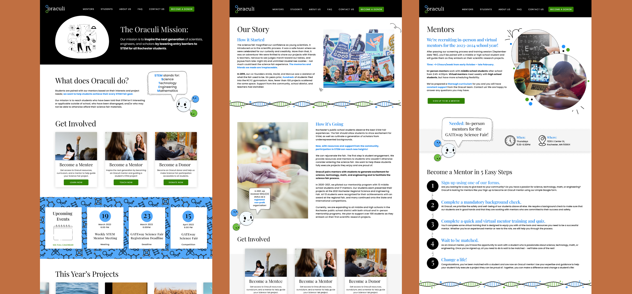
STEM can be intimidating without adequate resources and guidance. Oraculi aims to inspire the next generation of scholars through mentorship and Science Fair participation. However, Oraculi’s mission was being overshadowed by the cluttered and confusing website.
As a two-person design team, we redesigned the website based on UX principles by reorganizing the information architecture and visuals of the site.
PROBLEM SCOPE
POORLY ORGANIZED SITE
STEM can be intimidating without adequate resources and guidance. Oraculi aims to inspire the next generation of scholars through mentorship and Science Fair participation. However, Oraculi’s mission was being overshadowed by the cluttered and confusing website.
As a two-person design team, we redesigned the website based on UX principles by reorganizing the information architecture and visuals of the site.
FINAL SOLUTIONS:
SEAMLESS INTERACTIONS
Understanding the pain points and user needs, we made the following improvements to the website’s user experience:
Simplified navigation and reorganized information architecture.
Transferred crucial info from Google doc to the website to encourage more traffic.
Created a clean, intuitive, and mobile-friendly redesign for better accessibility.
GATHERING CONTEXT
EXPLORING EXISTING USER PLATFORMS AND EXPERIENCES
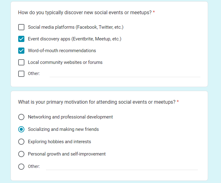
As part of my research process for the toGATHER app, I conducted user surveys to gather insights and understand the perspectives of potential users. To initiate this phase, I designed a well-structured Google form with 12 thought-provoking questions that covered topics such as event discovery, event participation, and social life satisfaction.
The survey was distributed to a diverse group of individuals, and I received responses from 34 participants. Analyzing the survey data allowed me to identify patterns, preferences, and pain points shared by the users. These findings played a crucial role in refining my interview script for conducting more in-depth user interviews.
GATHERING CONTEXT - USER SURVEYS AND INTERVIEWS
UNCOVERING PAIN POINTS VIA USER INTERVIEWS
In addition to user surveys, I conducted in-depth user interviews to gain deeper insights into the challenges and frustrations users faced when attending events and seeking social connections. From the pool of survey respondents, I selected 5 individuals to participate in these interviews. Through thoughtful and targeted questions, I was able to delve into their experiences, motivations, and concerns. These one-on-one interviews provided valuable qualitative data, allowing me to understand the "why" behind user behaviors and preferences. The insights gathered from the user interviews complemented the findings from the surveys and informed subsequent design decisions for the toGATHER app.
GATHERING MORE CONTEXT WITH RESEARCH
COMPETITIVE MARKET RESEARCH
Digging deep to understand the “why” behind low attendance rates, I spent time researching academic articles on human social behavior, dating apps, and online communities.
According to my secondary research, members of online environments who stay together display the same kinds of characteristics of community found offline, such as common language, rules of behavior, support, and communal history.
In addition to my secondary research, I conducted competitive market research on the top three products already on the market: Meetup, Eventbrite, and Facebook Groups. I compared and contrasted the various features that each app offered and concluded that Meetup had the features that users found the most useful. However, Meetup still wasn’t perfect.
EMPATHY MAPPING
PUTTING MYSELF IN THE SHOES OF THE USER
Based on the user interviews, I was able to use an empathy map to organize and group my findings into some definitive patterns that all my interviewees were frustrated with.
SYNTHESIS
ANALYZING THE DATA
Based on my research, I realized that there were a few common issues my interviewees had:
Stress of the unknown: Figuring out if anyone else is going, where to park, how long the event will be, and what is actually happening prevents users from going altogether.
Stranger danger: Users are less likely to go to an event (even one they are interested in) if they don't know anyone else who is going.
Difficulty finding events to attend: Many users seemed unhappy with their current method of finding events, which consisted of finding random flyers advertised around town or finding out through word-of-mouth.
SYNTHESIS
“HOW MIGHT WE…” QUESTIONS TO CONSIDER
How might we foster a sense of real community?
How might we alleviate fears of safety and social anxiety?
How might we encourage users to join groups and participate in said groups?
How might we standardize information so users have answers to their questions?
How might we incentivize users to attend the events they sign up for and not back out?
USER JOURNEY MAP
A USER’S JOURNEY THROUGH TOGATHER
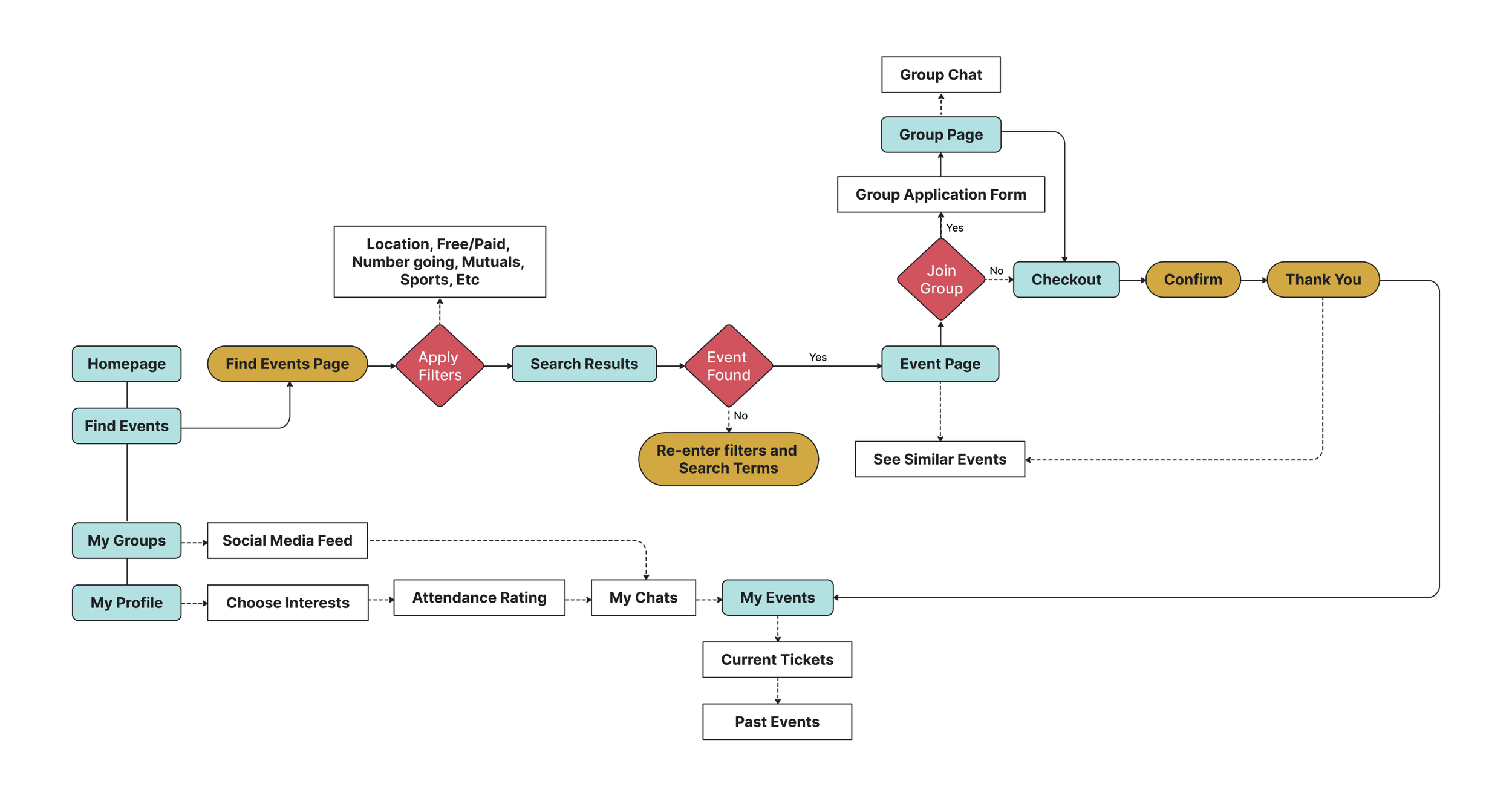
With the business goal of increasing attendance rates in mind, I focused on users finding an event, joining an event, and remembering that they signed up for an event.
The user journey focused on four main pages: the home page, search page, groups page, and profile page. Through my user journey I tried to create CTAs to bring users back to events.
FINDING SOLUTIONS
TRANSFORMING INSIGHTS INTO ACTION ITEMS
Based on my research and user feedback, I decided to focus on three main solutions to solve the original business problem of high event RSVPs and low event attendance.
Allow users to form connections before the event begins.
Provide users clear, standardized information about the event so that they know what to expect and aren’t blindsided: thus reducing the chances they will have a negative experience at the event.
Attendance ratings to incentivize the user to think before RSVPing to an event they are not likely to attend and reduce the chance of not showing up by providing consequences.
SKETCHES AND WIREFRAMES
EVOLVING DESIGNS FOR BOOSTING ATTENDANCE
Sketches and Low-fidelity Designs
My quick sketches and low-fidelity wireframes were very similar. However, after further consideration I realized it put too much emphasis on the process of getting a ticket, rather than the main business goal: increasing attendance rates. Therefore, pivoting as I went into high-fidelity designs, I made changes to the wireframes I brought into the usability tests.
High-fidelity Designs
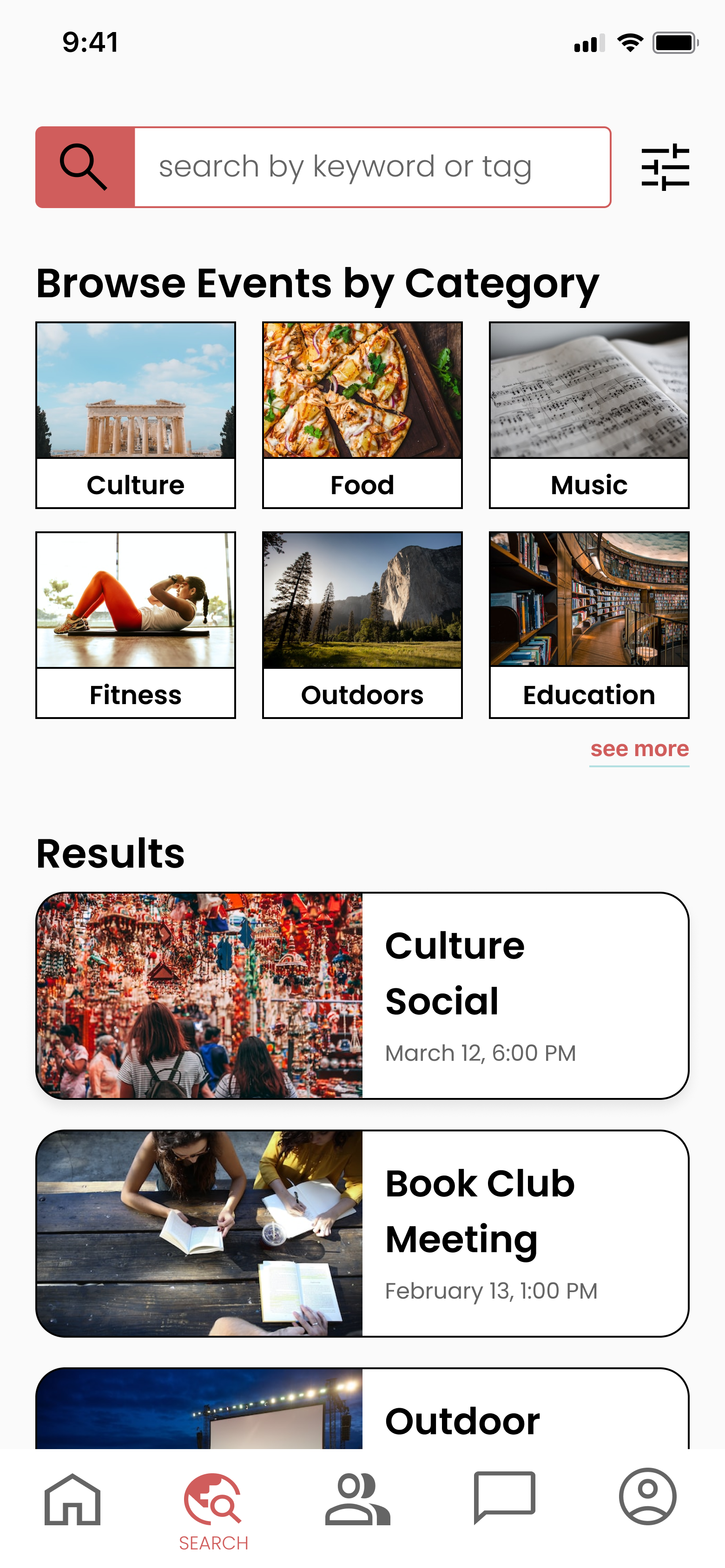
From the lo-fi to hi-fi wireframes, I put more emphasis on the social connections the app could help facilitate: I added a “groups” function as well as user profiles so users could display their interests and see other like-minded individuals. I also added a chat feature so users could talk with others before attending an event, alleviating some of the “stranger danger” anxiety.
USABILITY TESTING
INSIGHTS FROM TESTING FOR APP REFINEMENT
Conducting two different rounds of usability testing, I gathered feedback, iterating on my final designs after each round. This process greatly helped me reduce confusion in my app and allowed me to see how users were actually navigating the app to complete their tasks.
For the sake of brevity, here are three of the major changes I made to the project based on usability testing.
CHANGE 01— Streamlining Navigation: Taming Complexity with Overlays
A key challenge in this project was organizing information due to multiple access points to the same page and the complexity of the bottom navigation bar. To address this, I redesigned certain pages as overlays, simplifying the process while maintaining smooth navigation.
CHANGE 02— Enhancing Event Experience: Personalized Invites and Upcoming Events
I enhanced the homepage by incorporating event statistics and "upcoming" events to assist users in remembering their commitments. Additionally, to foster stronger attendance rates, I personalized event invites by including a brief message, based on feedback from interviewed users who expressed a preference for attending events with familiar faces.
CHANGE 03—Community Engagement: Revamped Group Pages for Vibrant Interactions
I improved the group page organization by refining the "main" and "social" tabs and adding an "about" page. I also introduced additional interaction features like event memories, discussions, and voice channels. These enhancements aim to cultivate a strong pre-event community and boost attendance rates.
CONCLUSION
EMPOWERING EVENT ATTENDANCE WITH TOGATHER
The main goal of this capstone was to create an app encouraging users to attend events and reduce the number of users who RSVP but do not attend.
ToGATHER focus on the community and social aspect of events to help users form connections before the event, thus making them more excited and comfortable attending.
Through constant user feedback, I was able to create an app that moves past simply “events” and solves the core job to be done: human connections.
WHAT I LEARNED:
MERGING KPIS AND BUSINESS GOALS
This project helped me learn more about business needs! In my first Capstone, it was 100% designed by myself so I was able to define my own KPIs. However, this project came with a specific goal: to increase event attendance rates.
I often had to think about the features and UI elements I was adding and ask myself, “Does this help the business goal I was given?” In my early wireframes, the designs I felt more like a ticketing service than a social product, but by pivoting, I was able to bring toGATHER back to my main goal.
NEXT STEPS:
ATTENDANCE SCORE GAMIFICATION SYSTEM
Something I would love to explore in future iterations is the attendance rating idea. Due to the time constraints of the project, I only had time to briefly allude to it and how it would work (with a high score meaning that you attend all the events you RSVP to).
In continued exploration, I would review how attendance score could correlate to various perks such as event discounts, or even other rewards in the app creating incentivization through methods of gamification.
OTHER CASE STUDIES:


