04 | THRIVE: empowering struggling college students through a task breakdown focus app.
SERVICE:
MOBILE APPLICATION
TEAM:
MYSELF (SOLE UI/UX DESIGNER)
TOOLKIT:
FIGMA
PEN, PAPER, POST-IT-NOTES
MIRO
GOOGLE DRIVE, MEET, AND DOCS
CLIENT:
PERSONAL CONCEPTUAL PROJECT
TIMELINE:
2 MONTHS
SEPTEMBER 20 - NOVEMBER 29
PROJECT OVERVIEW
WHAT IS THRIVE?
Staying on top of classwork, whether an essay, presentation, or other project, can be stressful – especially with bigger assignments. Thrive looks to empower students by helping break down large tasks into smaller, more manageable steps, so users can create progress toward completing their assignments on time.
My role as the sole designer was user research, product design, prototyping, usability testing, and redesigning the project based on what we found.
PROBLEM SCOPE
ACADEMIC OVERLOAD
With multiple classes that assign a multitude of assignments, students have a hard time managing their time effectively to get everything done, which leads to procrastination, cramming, and ultimately, feeling overwhelmed and stressed.
FINAL SOLUTIONS:
TASK-BASED SUCCESS
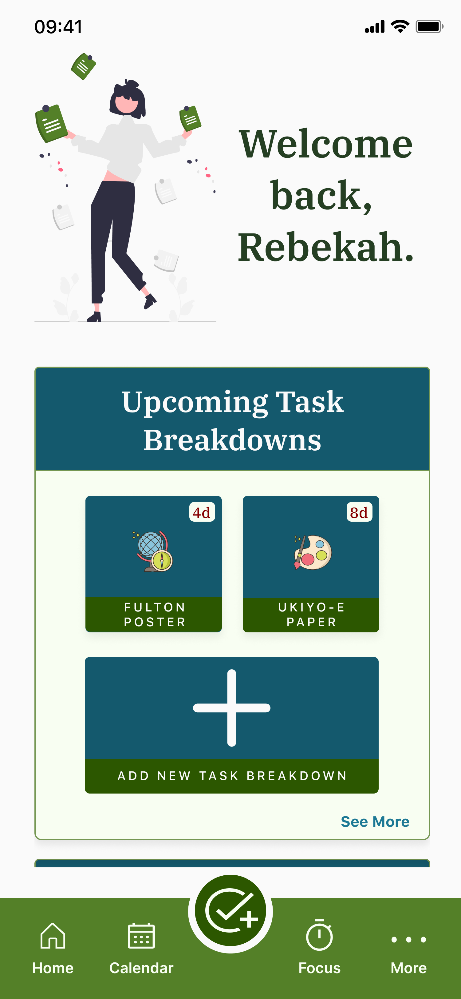
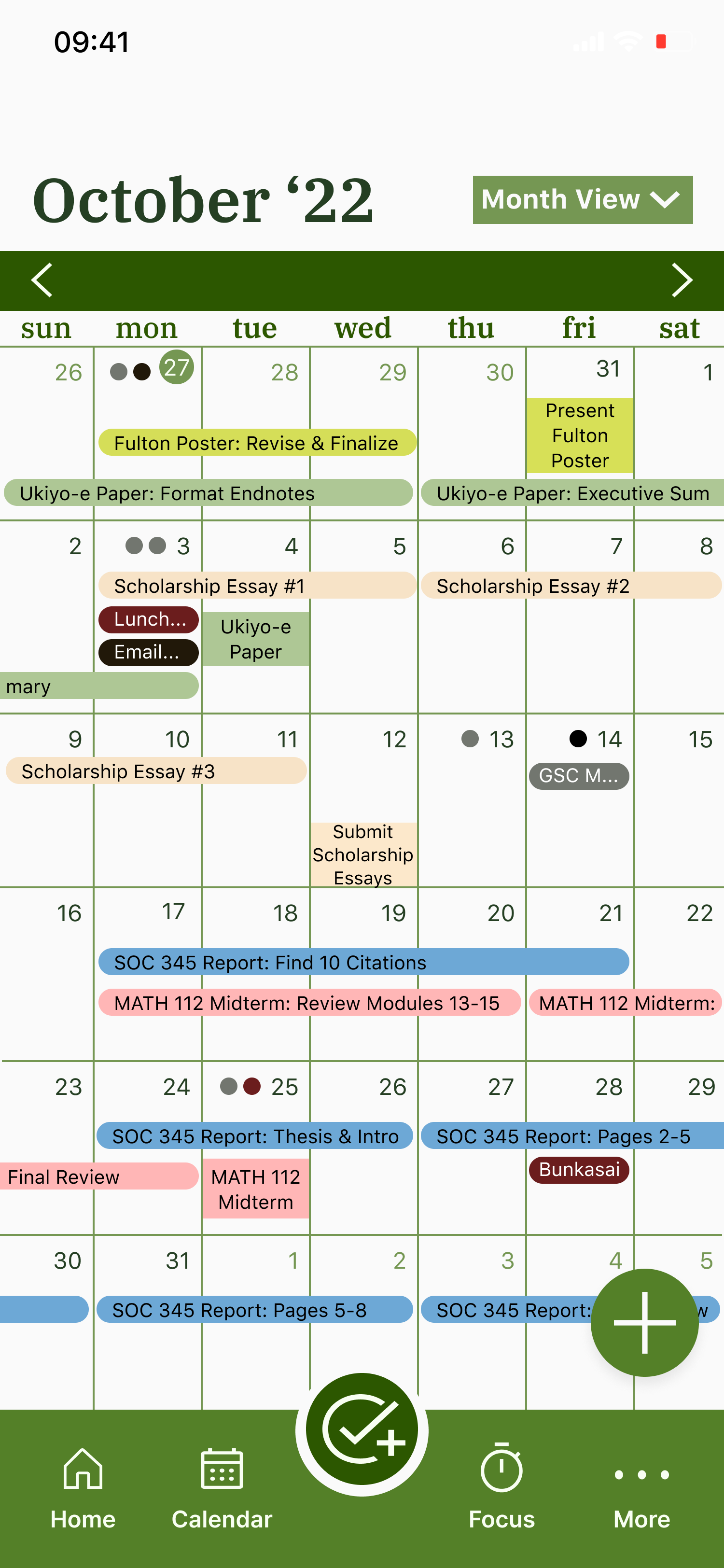
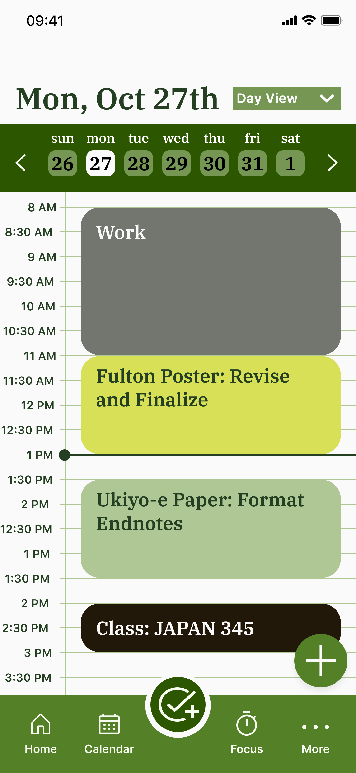
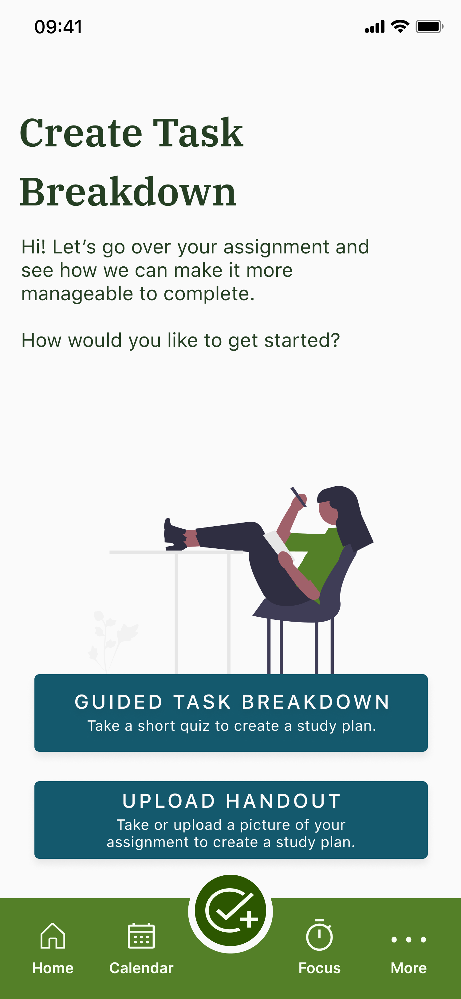
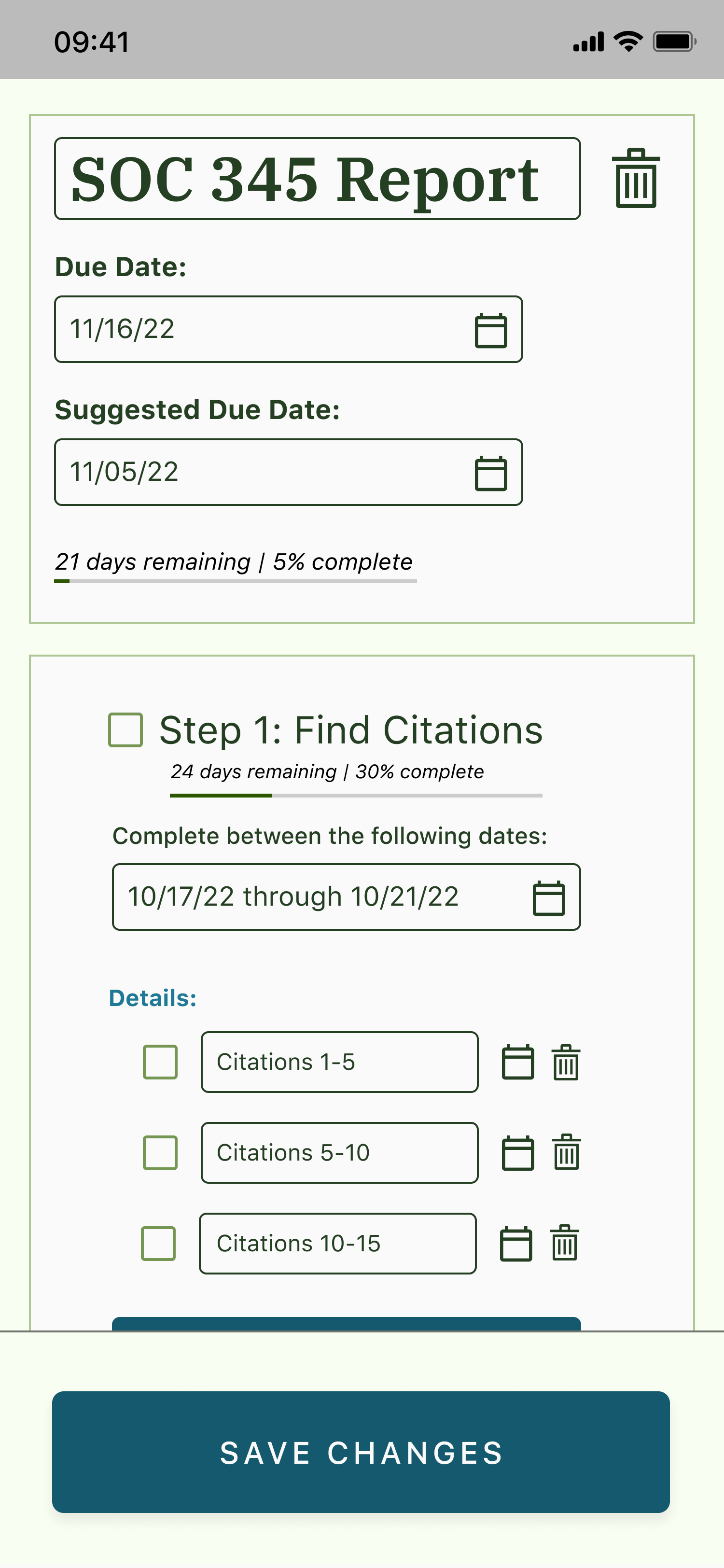
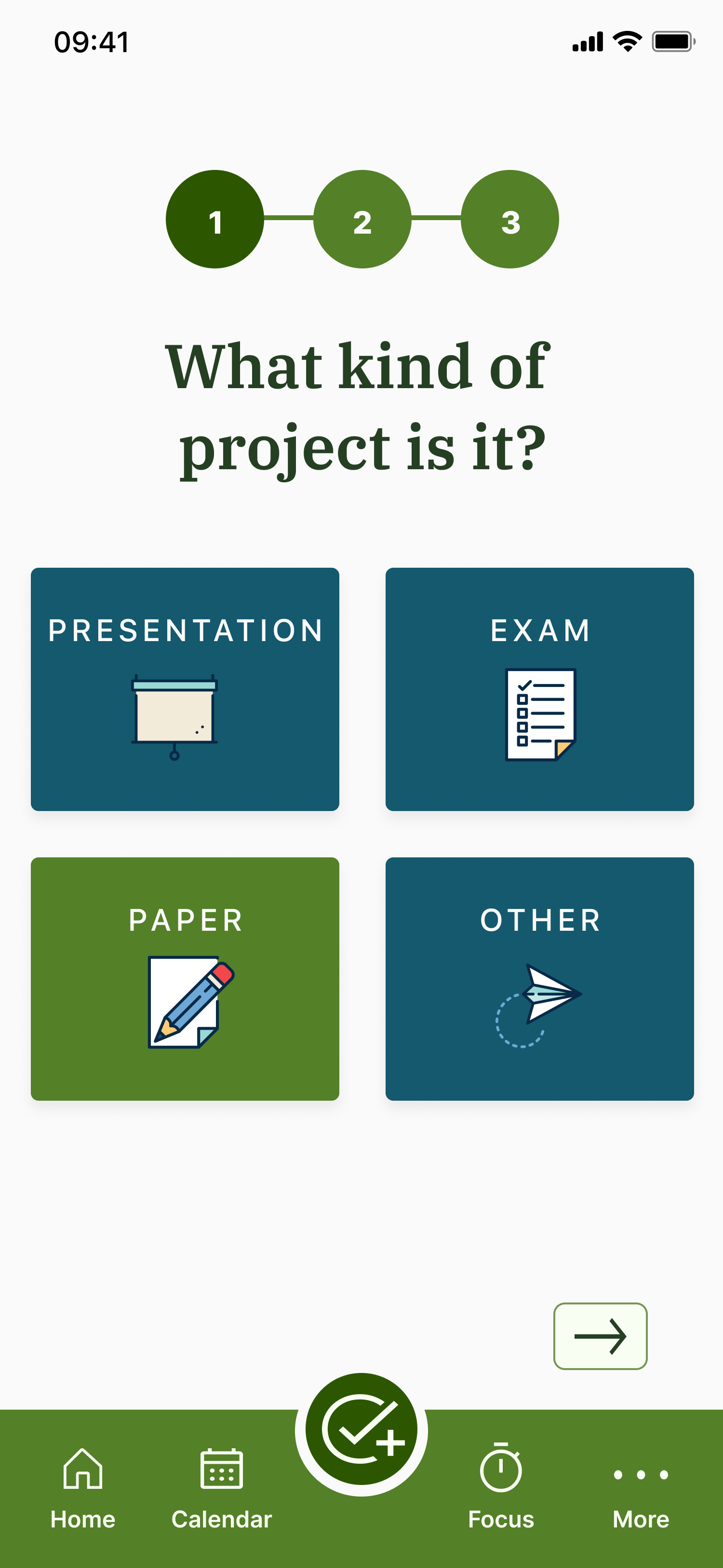
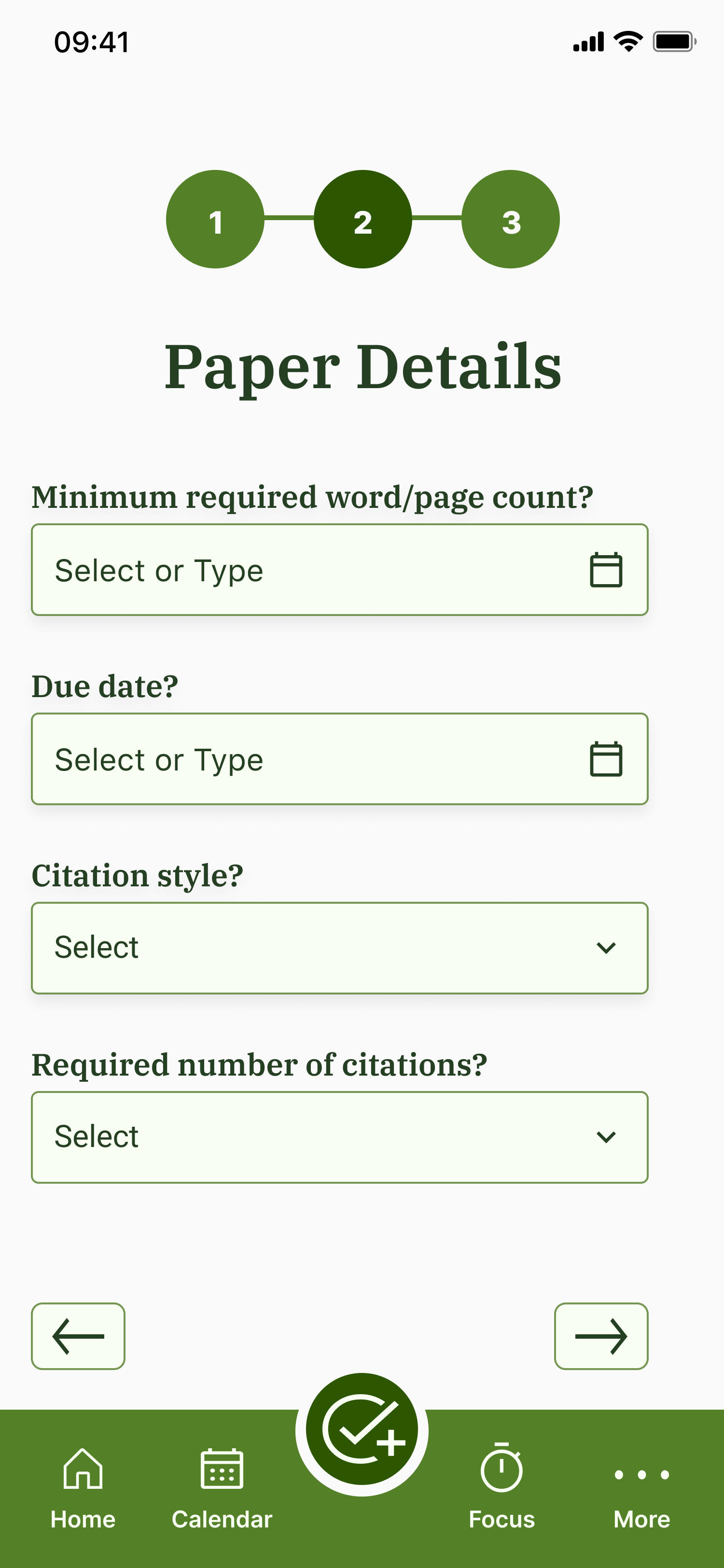
Thrive was created as a task management app to increase productivity and accountability throughout the semester by breaking down large tasks into more manageable tasks that the user can work on in specifically-blocked off days for the smaller assignments.
GATHERING CONTEXT - USER INTERVIEWS
WHAT DO STUDENTS STRUGGLE WITH THE MOST?
I conducted 5 user interviews, 2 with recent college graduates, and 3 with students currently enrolled in college. Out of these interviews...
FINDINGS
“HOW MIGHT WE?"
After synthesizing all of the data, I formulated three main “how might we” statements to guide my process moving forward.
How might we make users accountable to themselves and others?
How might we break down big projects into smaller tasks?
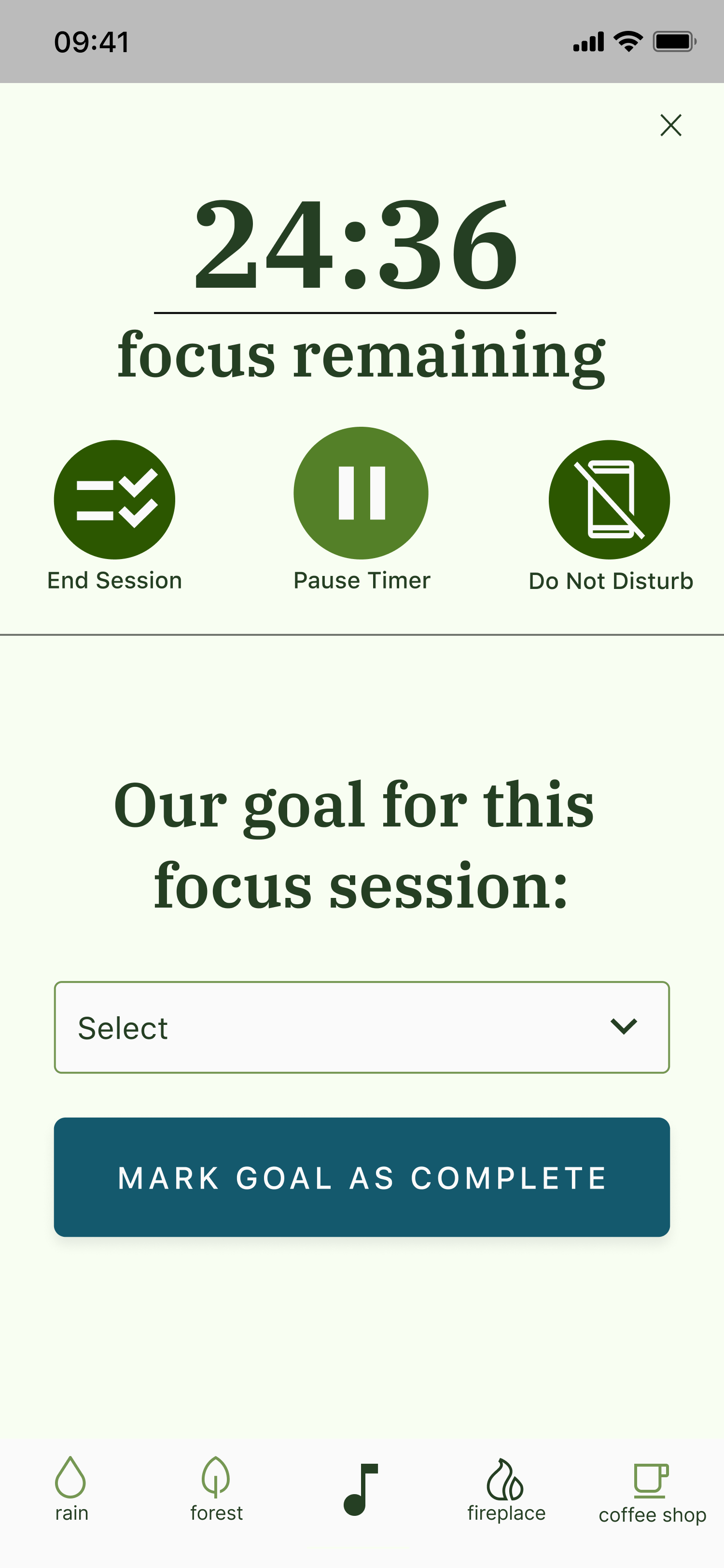
How might we encourage users to stay focused and not get distracted?
EMPATHY MAPPING
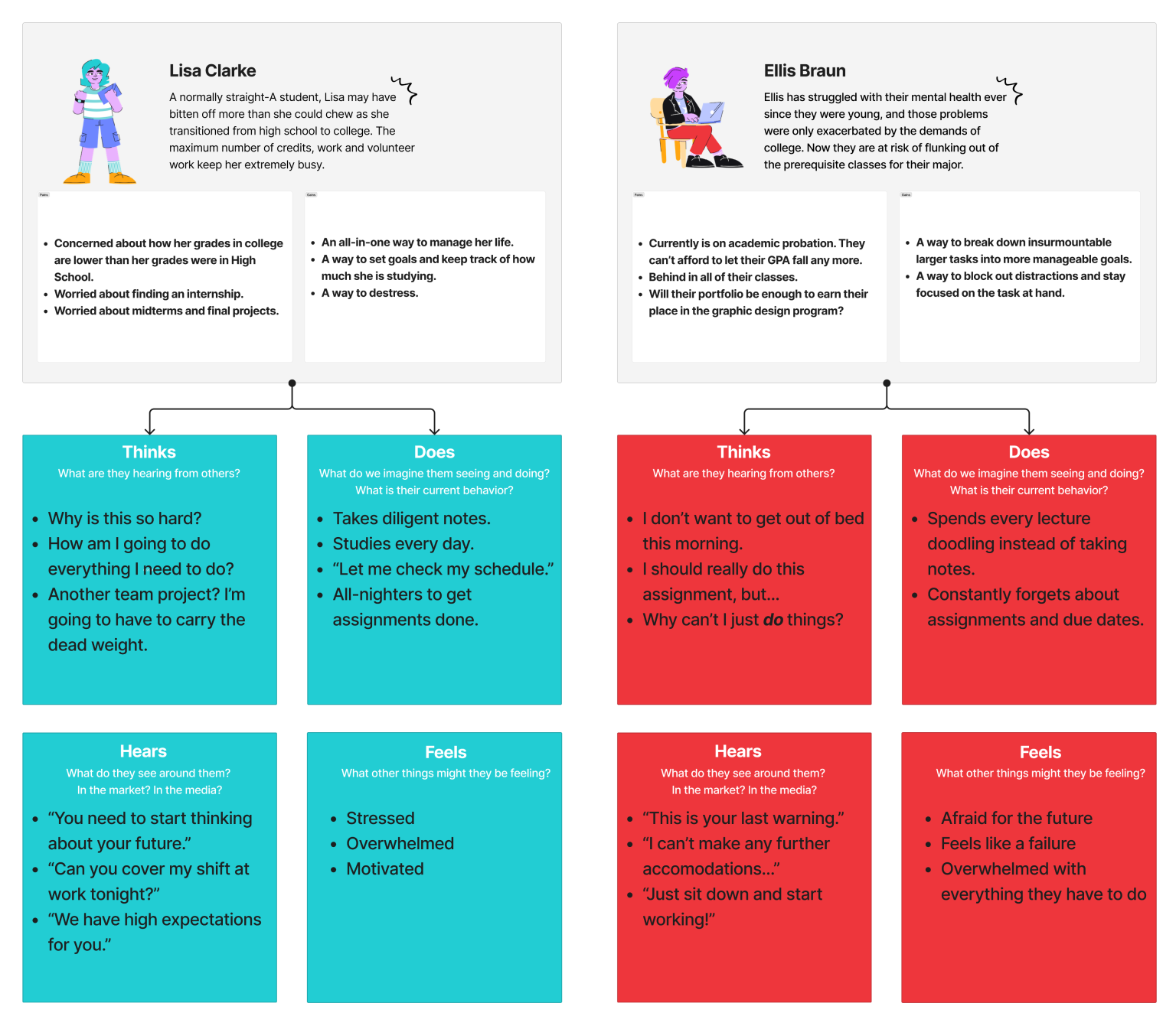
EMPATHIZING THROUGH USER PERSONAS
As a recent college graduate myself, I was keenly aware of the stress students face and with this in mind, I took the next step to research the users of the app.
Starting with brainstorming, I identified two primary target users of Thrive: User #1 was an overachiever struggling to manage their many demands, while User #2 is a burnt out student struggling with their mental health, which can make even the smallest task seem insurmountable.
IDEATING SOLUTIONS
CREATING MULTIPLE FORMS OF ACCOUNTABILITY
Using the “how might we” statements, I thought of three potential solutions to focus on and bring into my application:
Task Breakdowns
Break down difficult assignments into manageable tasks.
Accountability
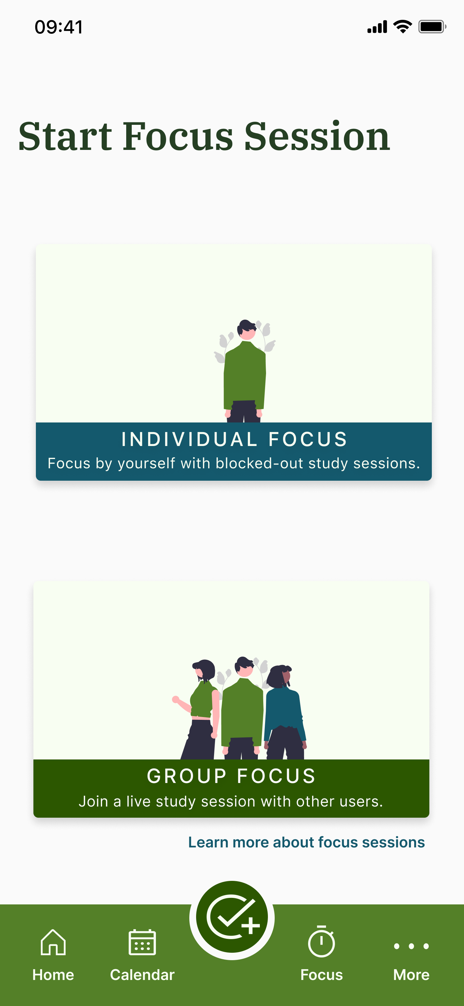
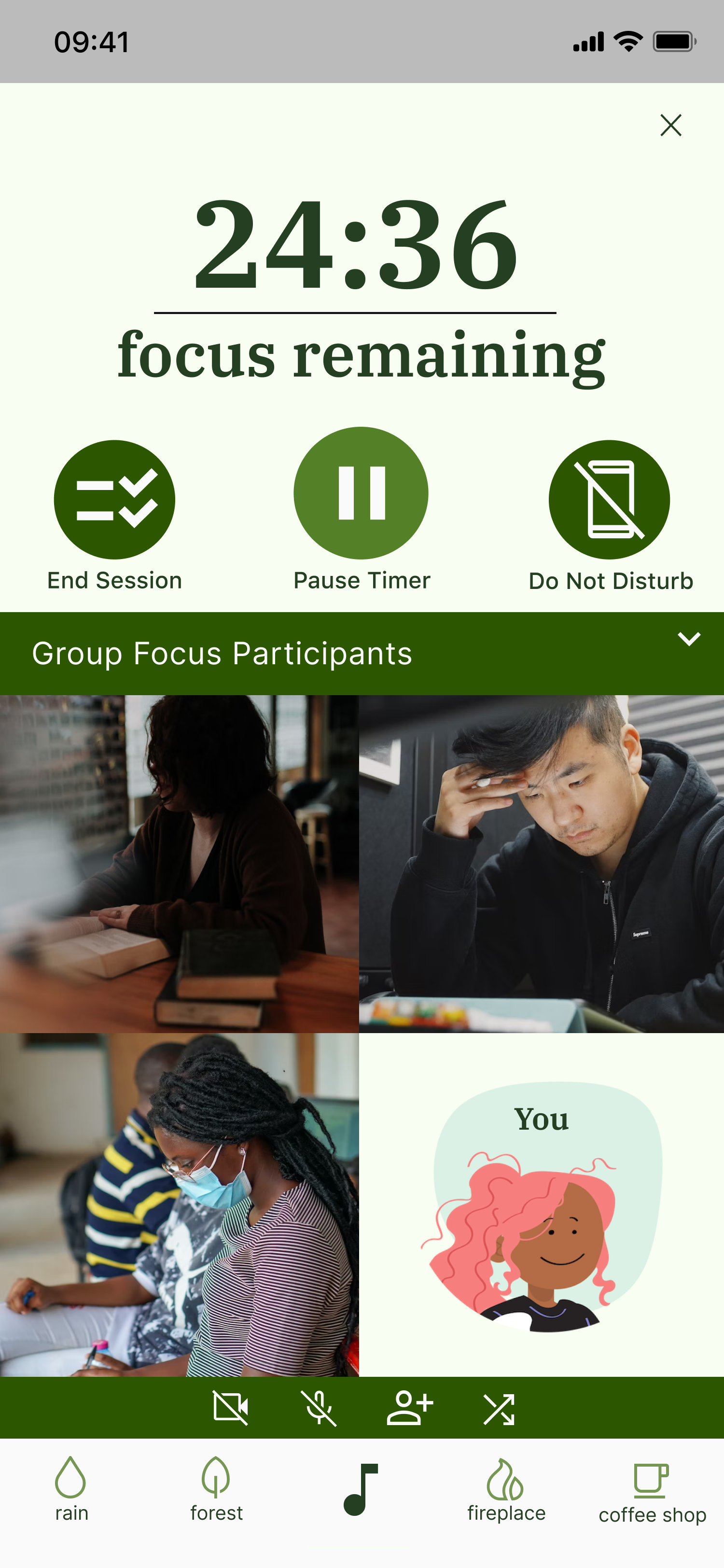
Remove distractions so users can focus on their tasks.
Assignment Tracking
Show tasks and events so users know their schedule.
BRINGING THE IDEAS TO LIFE THROUGH LO-FI SKETCHES
THE NITTY GRITTY PAPER SKETCHES
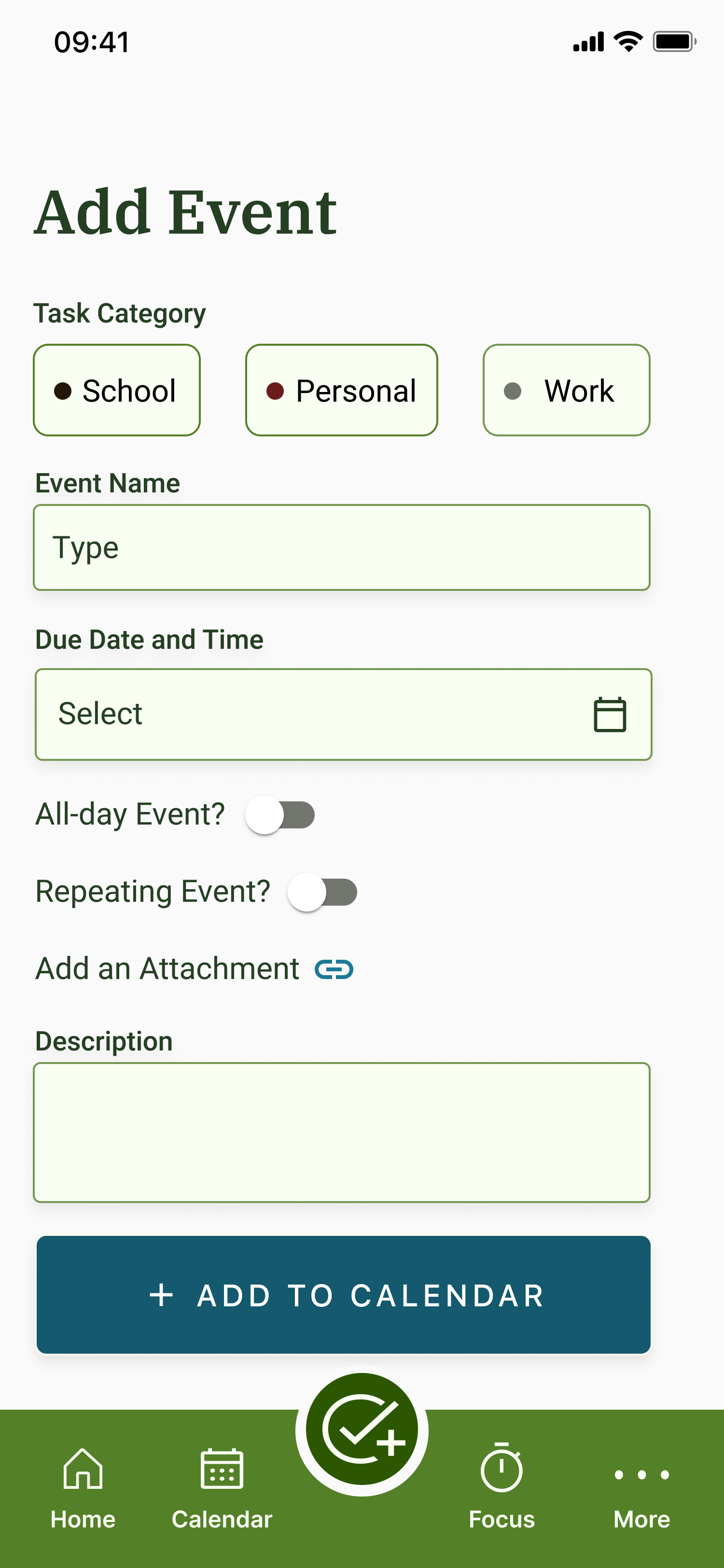
When I was initially brainstorming, I knew that the core features of the app would be task-based. Students could easily add tasks to their calendar, as well as take a quiz to break down large assignments into smaller chunks.
USER JOURNEY MAP
A USER’S JOURNEY THROUGH THRIVE
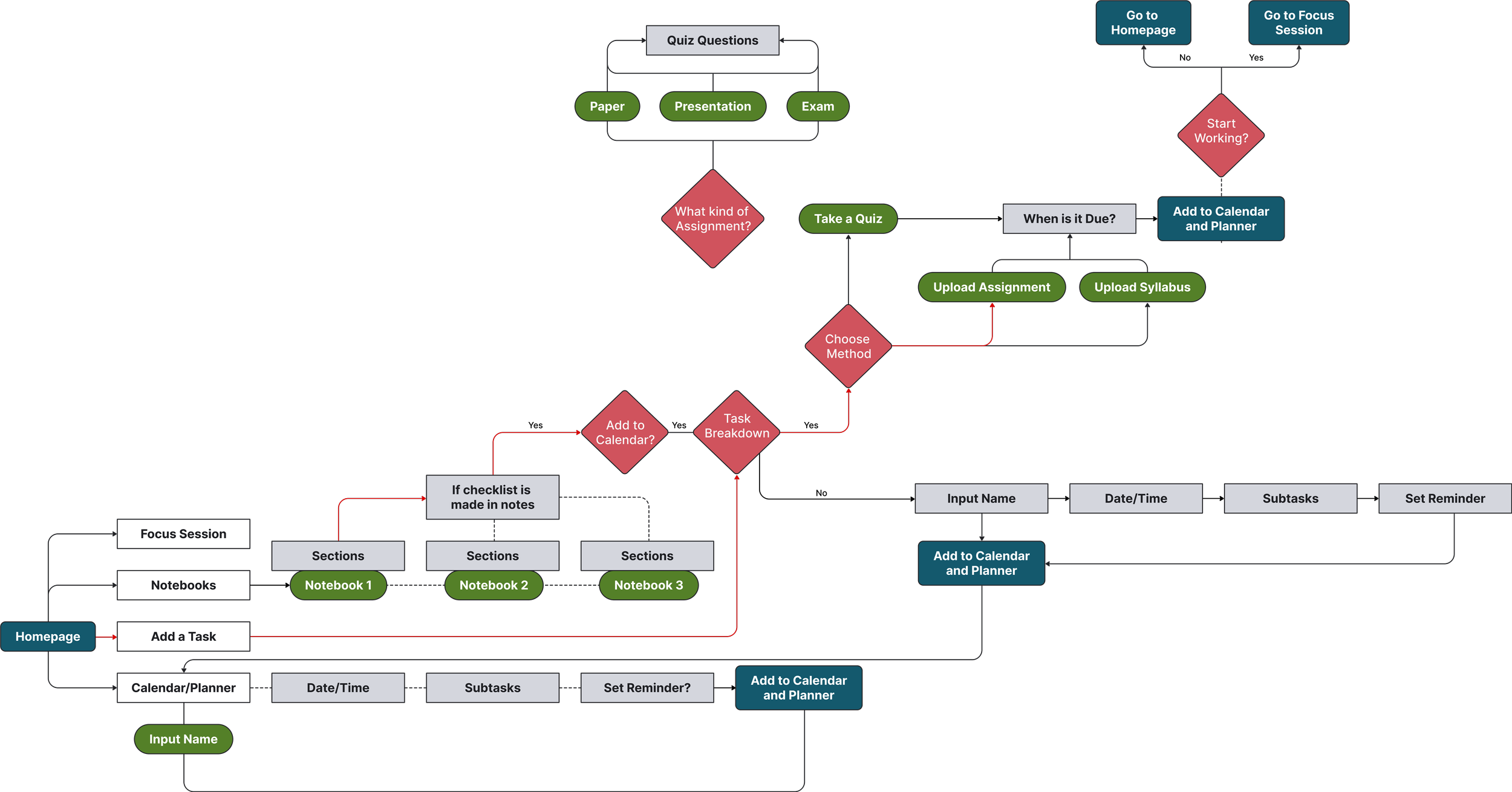
When I was creating the sitemap, I really wanted the emphasis to be on the task breakdown function of the app, so I made sure that the task breakdown was emphasized throughout the app at multiple points and that everything circled back to this feature.
STYLE GUIDELINES
CREATING A COHESIVE BRAND PLATFORM
As Thrive is a new application, a brand platform needed to be established. My inspiration for Thrive was that of a sprout, pushing forward through cracks in the concrete. Going through hardship, and overcoming it with hard work and patience.
The overall goal of the app was to empower students to achieve their goals at their own pace.
The design had to be mellow enough to relax stressed students opening the app, while also conveying reliability and motivation for users to get their assignments done.
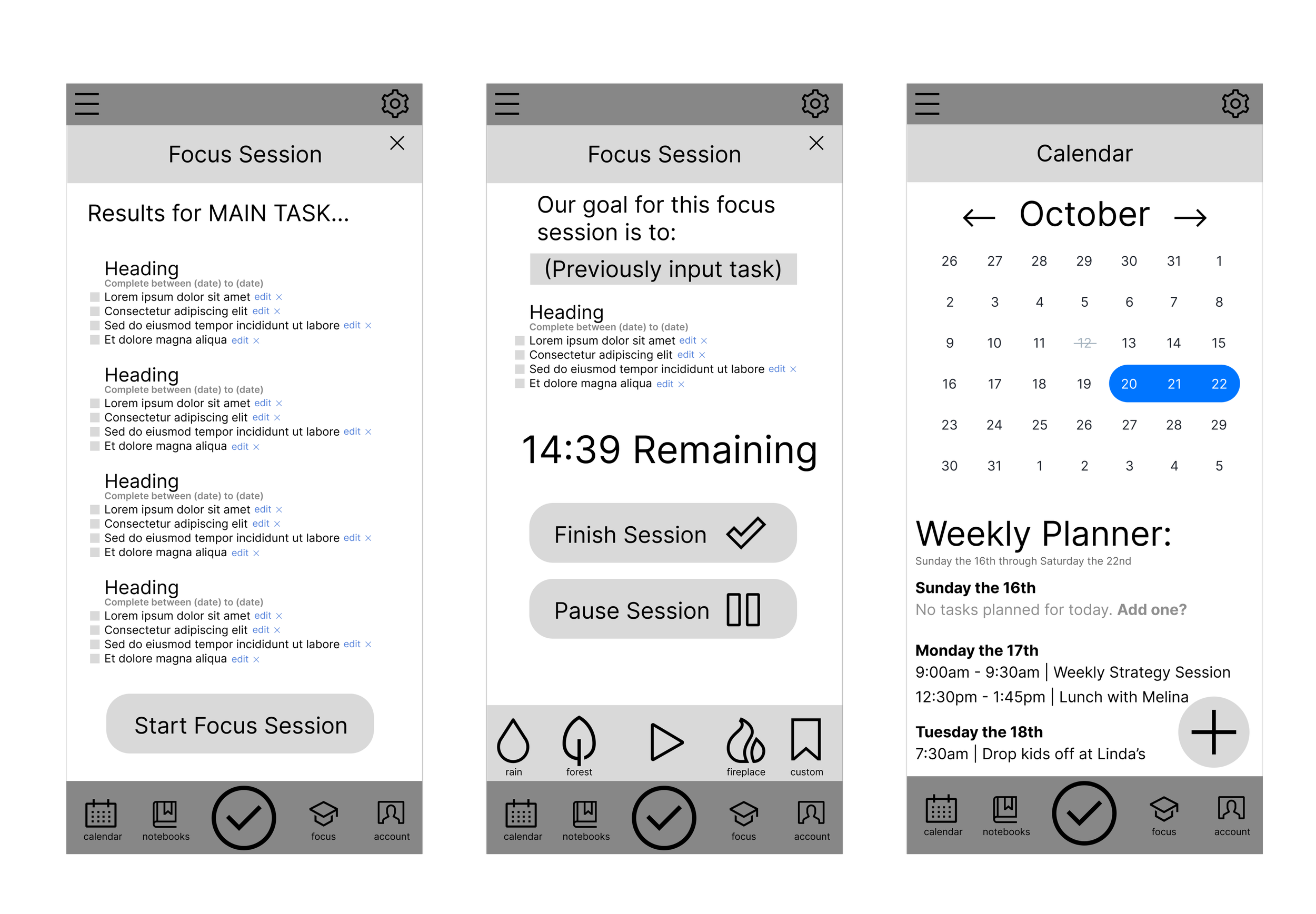
LOW-FIDELITY WIREFRAMES
FROM PAPER SKETCHES TO DIGITAL WIREFRAMES
In the low-fidelity wireframes, I created the first drafts for core features of Thrive: the task breakdown results page, a focus session, and the calendar. Creating these wireframes allowed me to play around with different elements I wanted to include without being weighed down with the aesthetics. I used these designs as a rough base to create the high-fidelity prototype.
MEDIUM-FIDELITY WIREFRAMES
REFINING A WORKING PROTOTYPE FOR TESTING
The prototype that I created for usability testing included all the features I thought would be necessary for the MVP, with updated visuals from the lower-fidelity wireframes.
USABILITY TESTING
INSIGHTS FROM TESTING FOR APP REFINEMENT
Conducting two different rounds of usability testing, I gathered feedback, iterating on my final designs after each round. This process greatly helped me reduce confusion in my app and allowed me to see how users were actually navigating the app to complete their tasks.
For the sake of brevity, here are three of the major changes I made to the project based on usability testing.
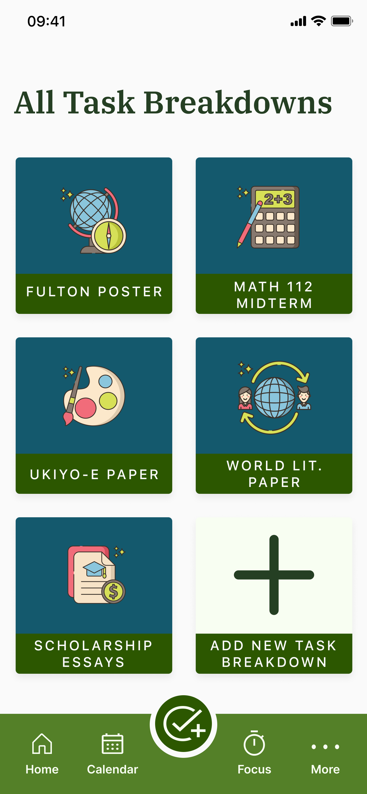
CHANGE 01— No navigation to a task breakdown that had already been created.
During one usability testing session, I had a participant go through the entire process of creating a task breakdown for an imagined assignment. Once they reached the task breakdown results page, they said, “This is great and all, but how do I navigate back to this page? Do I have to redo the task breakdown every single time I open the app?”
To my horror, I realized that I had created NO way for the user to see task breakdowns that had already been made. This experience highlighted the importance of usability testing, and I was able to add in the necessary page before my next usability test.
CHANGE 02— The task breakdown results page was confusing and cluttered.
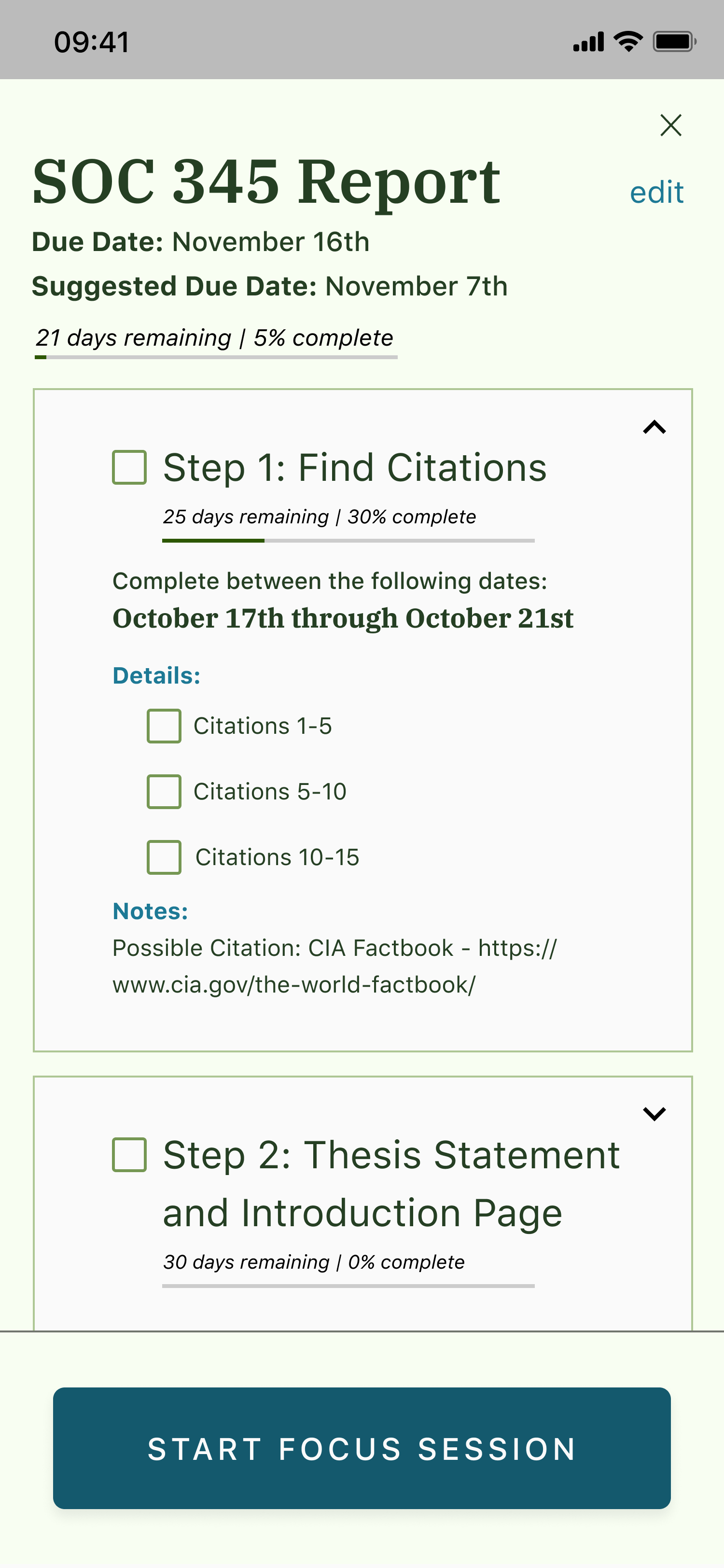
This was the most information and text-heavy page of the app, and testing revealed that users were unsure of the page’s purpose or overwhelmed with the large amount of information.
In the end, I made each step a collapsible card so that it was easier for the student to focus on the information that they needed at the moment.
CHANGE 03— Notebooks were unnecessary and ultimately harmed the solution.
In my original solution, I had imagined an all-in-one comprehensive application that students could use for all of their academic needs, including note-taking. However, user assumptions for how the page would be used made it clear that it didn’t really fit with how the project had evolved. In the end, I decided that removing that page entirely was the best solution.
This also allowed for the app’s organization to improve, as I removed the home button from the top left of the page and brought it down into the bottom navigation bar.
CONCLUSION
EMPOWERING STUDENTS THROUGH THRIVE
As students are constantly overwhelmed with assignments, Thrive was created as a way to more effectively complete tasks throughout the semester and reduce stress.
By empathizing with user needs and continued iteration, I was able to create an application that breaks through surface-level motivation, but empowers them to take control of their semester.
The final clickable design can be found below.
WHAT I LEARNED:
SOMETIMES, LESS IS MORE
As this was my first project, I learned a lot! However, one thing that kept coming back was the idea of a Minimum Viable Product. I had so many ideas for what the app could be in the future that I sometimes forgot the original goal of Thrive and went off track, like with the notebooks idea. However, I was always able to get back on track.
NEXT STEPS:
FLESHING OUT THE DETAILS
In future iterations I would continue to explore:
How user data is collected to generate the task breakdowns.
How to create community within the app to improve accountability.
OTHER CASE STUDIES:


