WAM —
a re-design of Weave’s internal account manager
2024 Summer Internship
Service: Desktop Application
Team: Myself (Product Designer), Taylor Baker (Project Manager), Pablo Trujilio (Software Engineer), Eric Gish (Software Engineer)
Timeline: 3 Months (May - July)
Toolkit: Figma / Figjam, Pendo, Mobbin, Maze, Pastel
WAM helps Weave manage control lists, user roles, onboarding, and more, but it was outdated and not user-friendly.
WAM is a crucial tool used within Weave to help manage company control lists, user roles, onboarding components, and more. Without a dedicated team to manage WAM, it became outdated and not functional. My goal was to improve the site’s user experience based on stakeholders’ pain points, enhance functional integration, and to ensure compliance with Weave’s design system. Through research, cross-functional collaboration across departments and my own Triad team, I was able to improve the WAM experience with changed navigational and information architecture improvements, new features, and streamlined user flows.
WAM used to be the end-all be-all of Weave, but as the products progressed, many features and functionalities were moved to other platforms: namely the “New Weave Experience” and the “Portal.” However, WAM couldn’t be entirely removed because some key functionalities were only accessible through it.
Additionally, because there wasn’t a dedicated “WAM Team,” whenever features and pages were added to WAM, there was no cohesion even within itself, and it did not adhere to design best practices.
My research: conducting a usability audit, creating a survey, and conducting user interviews.
I came into this project with very little context of WAM or Weave’s other products. Additionally, I was given a lot of overhead by the Director of Design to improve WAM.
There was very little quantitative data on WAM because we were’’t using Pendo on it. So I had to do a lot of context gathering myself to figure out the problem scope and the solution (with the help of my triad team!)
The first thing that I did was conduct a usability audit on the then current WAM experience. I noted down anything that seemed like a bad user experience (red), anything that needed improvement (yellow), things I liked about the experience (green), as well as questions that I had (blue), either to ask my triad team or in my user interviews.
I used the insights I gathered from my usability audit to inform my interview script. Next, was the user interviews…
Talking with my users: 10+ departments to impact 500+ Weave employees!
WAM is used by a large host of internal Weave users, spanning many departments: Training, 3 Tiers of Customer/Tech Support, Security, Payments, Onboarding, Engineering, Customer Experience, Channel Partners, Accounting, Product, Sales Ops, and more.
My first step was to meet with these stakeholders to learn more about how they utilize WAM: what were their pain points, likes/dislikes, and common use cases/flows? What this meant was that half of the battle was scheduling! After a lot of enlightening conversations, I used Maze to help tag and organize my findings. What I was left with was a comprehensive list of pain points (in red) and improvement ideas (both my own and stakeholders.)
Aligning expectations with my team: checking for feasibility and creating a MVP plan.
In this project, I worked as the sole product designer along with my Triad: two amazing engineers and an awesome PM. Communicating closely with them was integral to the success of the project, and together we broke the WAM redesign into phases. WAM is such a big experience that fighting scope creep, especially with a 3-month timeline, was key. In the end, we narrowed down the pain points into the highest value changes with the least amount of work involved. They are as follows:
Feature Flags: difficulties turning features on/off for customer locations.
Multi Location and Parent-Child Views: WAM was created so long ago, with only single-locations in mind. Therefore, with the addition of multi-office locations and organizations, it was very difficult to see the relationship between related offices.
Dashboard Potential: as the first page stakeholders were navigated upon choosing a location, it took up prime real estate but offered no value - no one used it.
Better contextual filters for information - WAM is a very information-dense website, but stakeholders often had to manually scroll, search, and scan in order to complete their daily tasks. Streamlining these processes was important.
IA and Navigation Improvements: The navigation was poorly placed in the middle of the screen, with two different levels that caused confusion, with information out of place and in unexpected locations.
Pain points: WAM is confusing, inconsistent, and ugly.
Like… pick a struggle, amirite?
After consulting with the stakeholders and performing a thorough audit of the current WAM experience, I felt like I had a good understanding of WAM’s core problems, namely:
WAM Inconsistencies and Functionality Failures
Security and Access Control Issues
Managing and Utilizing Feature Flags
Navigation and UI Design Flaws
In terms of stakeholder needs, the most commonly talked about requests were:
Desire for a more customizable experience
Desire for more accessible records / history
More organization options throughout
More integrations with other used software
Better filters that actually work
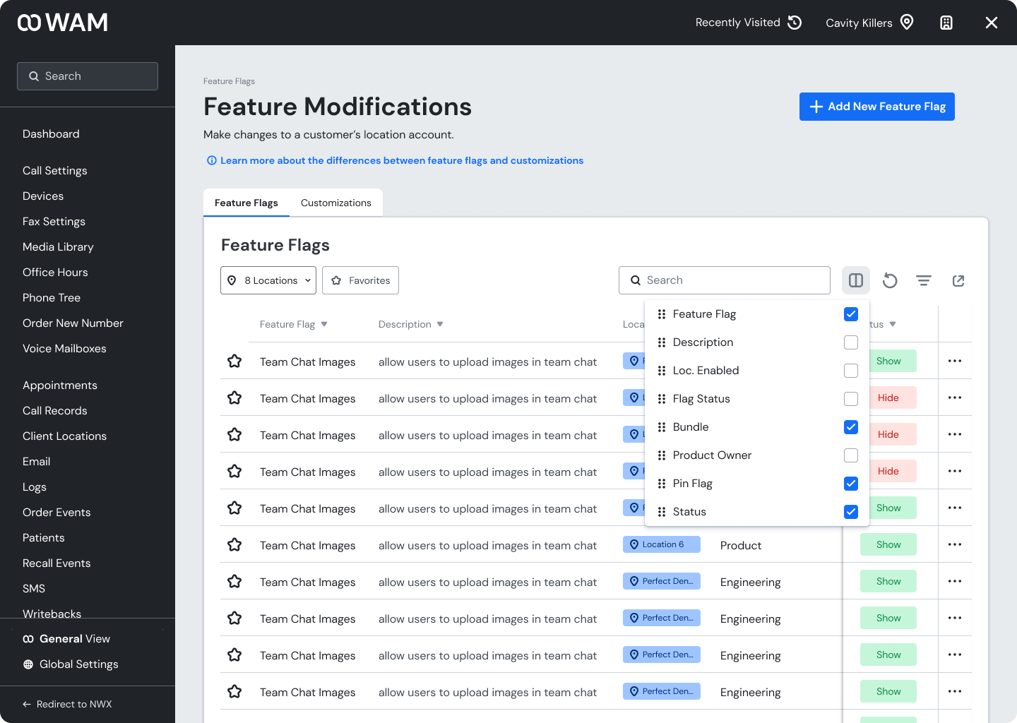
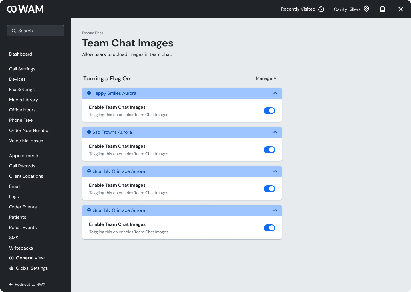
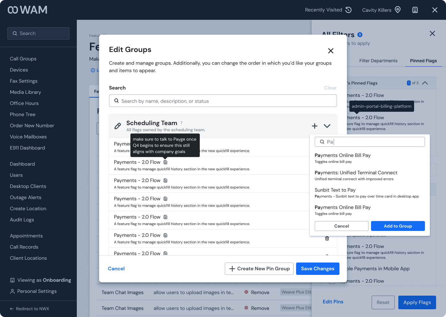
I added the ability to add feature flags to groups in order to mass apply the feature. Additionally, users can now bulk apply a specific flag to all locations within an office!
Feature Flags are supposed to be a temporary measure, but they have not been treated that way. Right now there are too many feature flags to sift through and repetitive and time-consuming to turn on multiple flags for a location, or for multi-offices.
I made many changes to the feature flags, including a way to slowly phase out out-of-date flags, but to focus on just two improvements:
Feature 1: Empowering users to create their own feature flag groups to speed up the process of turning flags on/off en masse.
Feature 2: The ability to turn on a flag for all locations within an office.
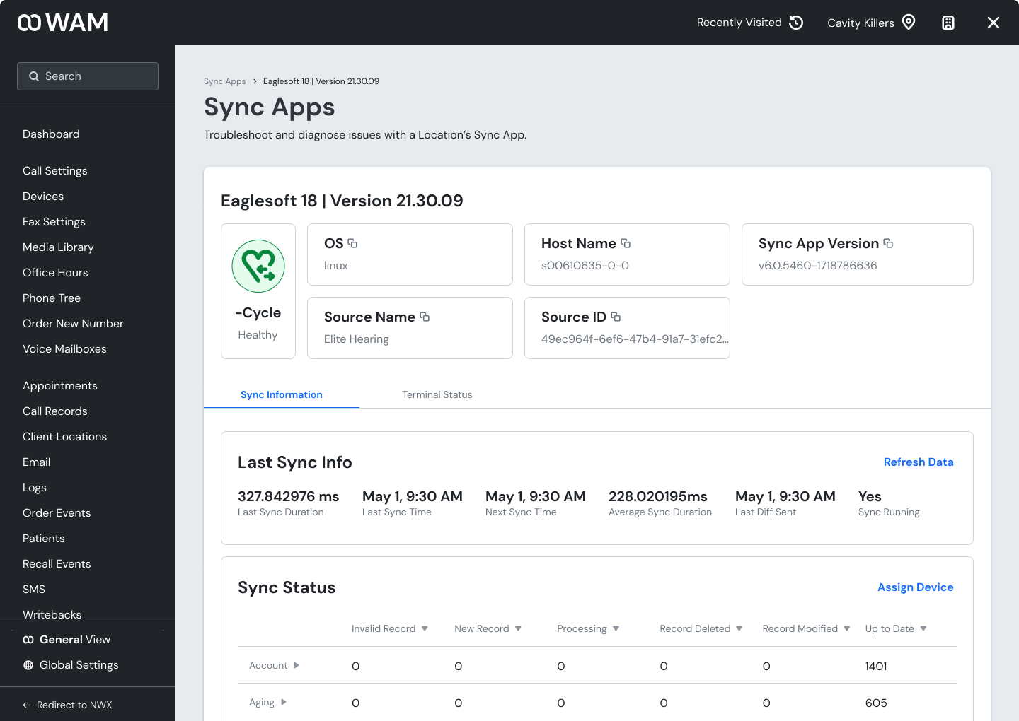
I improved the dashboard experience and moved the location information tray to a more functional, yet still accessible location.
The old location information tray was not optimized for multi-office locations. It was very difficult to see the relationship between parent-child offices and switch between the information of different offices. Additionally, it took up a lot of space, leaving less room for work.
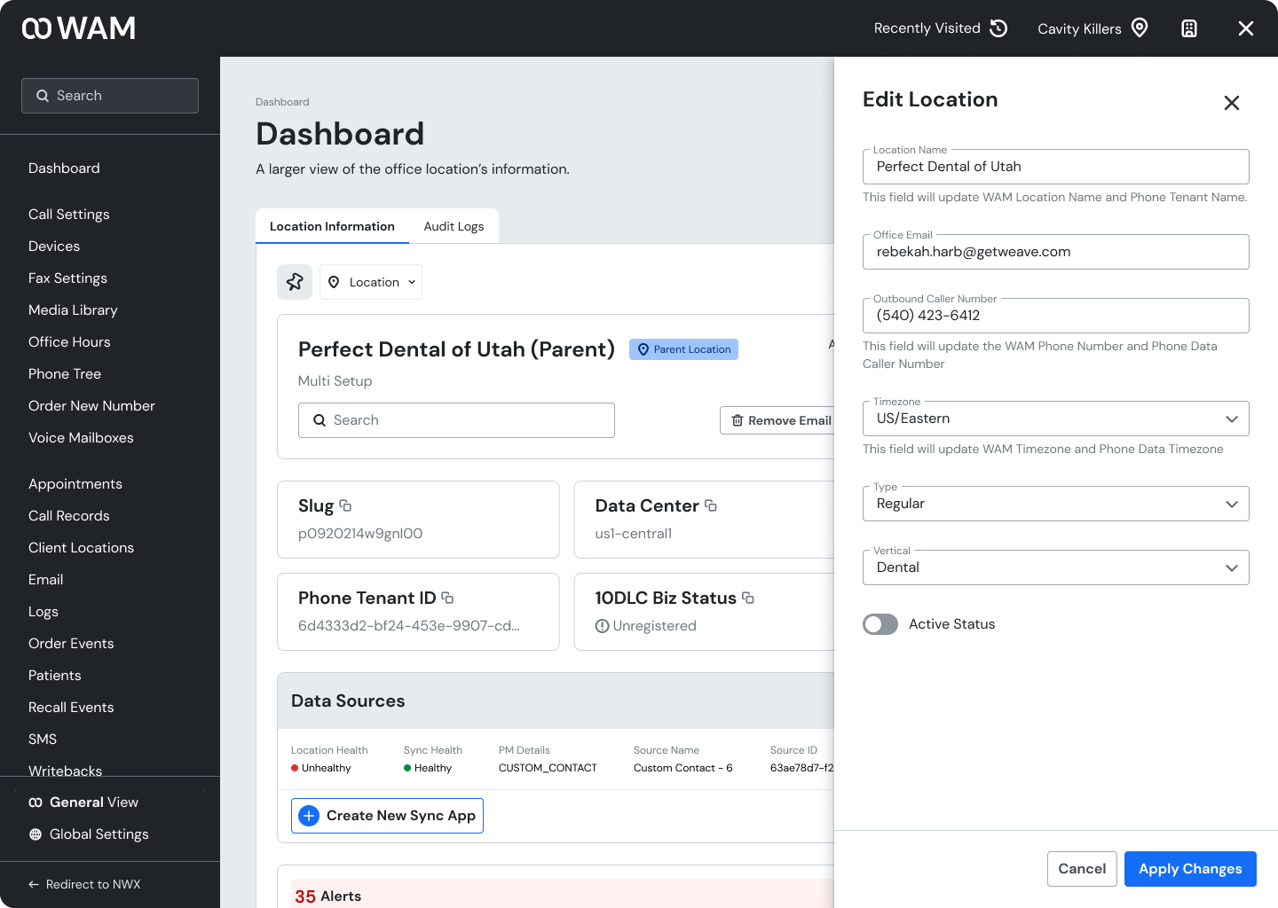
In the new solution, the dashboard displays the same information as the location info tray (with a few more benefits.) That means if all you need is something from the tray, you’re able to do it without any additional clicks. However, if you need to access the information from a different page, you can just pop up the location info tray from the top right corner!
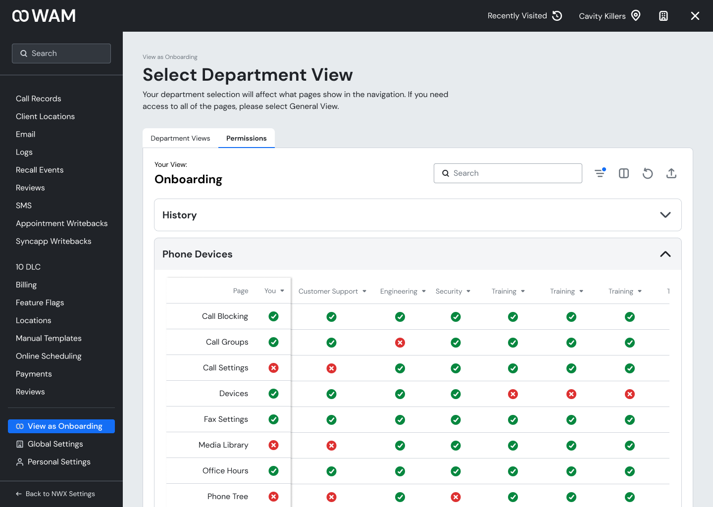
I added “department views” to improve the navigation experience and improve security access controls and work flows.
The old WAM has many different pages and functionalities, but most users usually only need to access a few for their work. Additionally, many users have access to pages that they do not need, security-wise. In the past, there have been instances of accidental changes by someone who is unaware of the ramifications that makes a negative impact on the customer.
In order to clean up the side navigation (aka prevent scroll-mageddon) I introduced department views, where each department can choose which pages are needed for their personal needs. Don’t worry, if you need to see all of the available pages in WAM, there is a read-only general view.
In the end, I redesigned WAM by optimizing old features, adding new features to improve workflows, and aligned the product with Weave’s core brand and image.
Some success metrics that I’m particularly proud of:
100% of tested users felt as though the redesign addressed their major concerns with WAM.
Overall satisfaction score increased from a 5/10 to an 8/10!
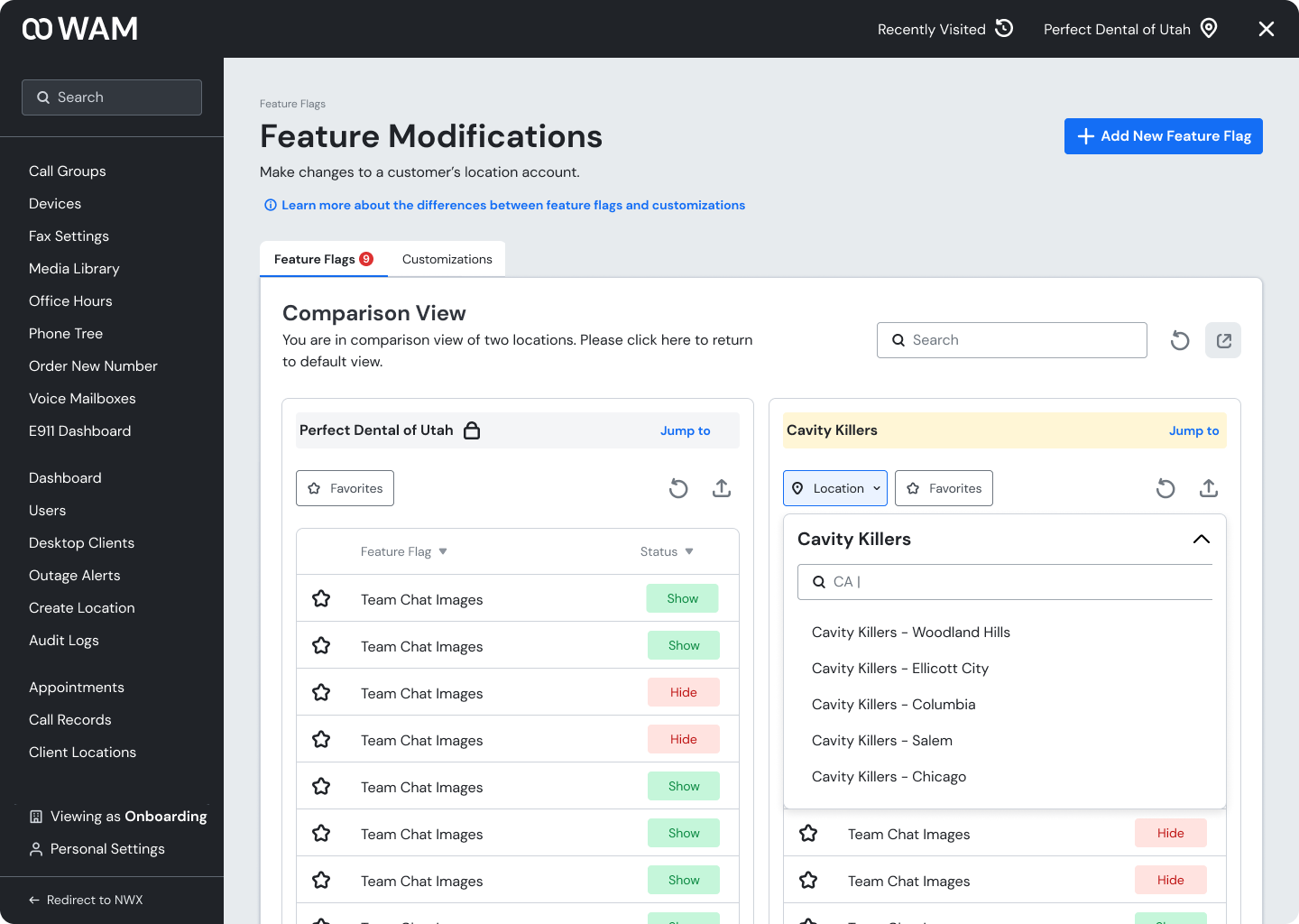
Through user testing, research, and iterative design, internal stakeholders can now complete their daily tasks in WAM much more quickly with the new features, especially related to Feature Flags: bulk editing, location comparison views, pin groups, and more.
Additionally, the more intuitive design decreases overload and decision fatigue among users, especially new employees.
It’s also important to note that while WAM is an internal tool, it has very real ramifications on Weave’s customer base. For example, one support agent told me that because a certain aspect of the old WAM didn’t work (by the way, even though it didn’t work, if you tried to use it a success pop-up would appear), they had to use an external tool that took up to 30 minutes! That can translate to a lot of customer frustration when they call Weave wanting answers and a quick fix. By improving internal tooling and optimizing employee efficiency, I was indirectly able to improve the customer experience.
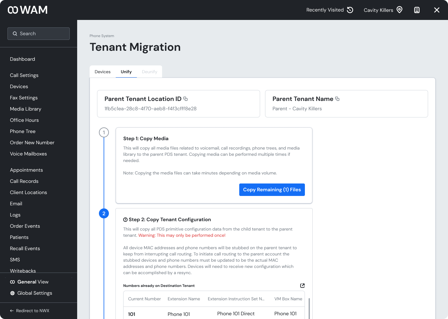
Some final screenshots of some of the changes!
Future iterations of WAM: what I’d improve if I had more time!
Data Beta Locations
There is an instance of a location group that may share data and not tenants, otherwise known as Data Beta. A user should be able to determine if phones are shared or not without needing to look into Tenant
Full Settings 2.0 Integration:
Initially, I aimed to integrate WAM into the settings flow of Weave’s New Weave Experience beta. However, our team concluded it wasn’t feasible due to complications such as increased load times from mixing internal and customer-facing tools, more frequent refreshes during deployments, and potential issues with WAM-specific bugs or features affecting customers. Given more time and exploration, I believe these challenges could be addressed.
Bulk Actions for Multi-Locations:
Because this was not a big part of the initial exploration with stakeholders, we determined that more research would have to be done to ensure that there were use cases for the feature.


